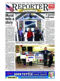
Transcription of REQUIREMENTS AND SUGGESTIONS FOR TYPOGRAPHY IN …
1 - 1 - REQUIREMENTS AND SUGGESTIONS FOR TYPOGRAPHY IN BRIEFS AND OTHER PAPERS Federal Rule of Appellate Procedure 32 contains detailed REQUIREMENTS for the production of briefs, motions, appendices, and other papers that will be presented to the judges. Rule 32 is designed not only to make documents more readable but also to ensure that different methods of reproduction (and different levels of technological sophistication among lawyers) do not affect the length of a brief. The following information may help you better under-stand Rule 32 and associated local rules. The Committee Note to Rule 32 pro-vides additional helpful information. This section of the handbook also includes some SUGGESTIONS to help you make your submissions more legible and thus more likely to be grasped and retained.
2 In days gone past lawyers would send their work to printers, who knew the tricks of that trade. Now composition is in-house, done by people with no education in printing. Some of the printer s toolkit is simple to use, however. Subsection 5, below, contains these hints. 1. Rule 32(a)(1)(B) requires text to be reproduced with a clarity that equals or exceeds the output of a laser printer. The resolution of a laser printer is expressed in dots per inch. First generation laser printers broke each inch into 300 dots vertically and horizontally, creating characters from this 90,000-dot matrix. Second generation laser printers use 600 or 1200 dots per inch in each direction and thus produce a sharper, more easily readable output; commercial typesetters use 2400 dots per inch.
3 Any means of producing text that yields 300 dots per inch or more is ac-ceptable. Daisy-wheel, typewriter, commercial printing, and many ink-jet printers meet this standard, as do photocopies of originals produced by these methods. Dot matrix printers and fax machines use lower resolution, and their output is unacceptable. Although Rule 32(a) applies only to briefs and motions, we urge counsel to maintain this standard of clarity in appendices. A faxed copy of the district court s opinion, or text from Lexis or Westlaw printed by a dot-matrix printer, is needlessly hard to read. Use photocopies of the district court s original opinion and other documents in the record.
4 2. Rule 32(a)(5) distinguishes between proportional and monospaced fonts, and between serif and sans-serif type. It also requires knowledge of points and pitch. Proportionally spaced type uses different widths for different characters. Most of this handbook is in proportionally spaced type. A monospaced face, by contrast, uses the same width for each character. Most typewriters produce monospaced type, and most computers also can do so using fonts with names such as Courier, Courier New, or Andale Mono. The rule leaves to each lawyer the choice between proportional and monospaced type. - 2 - This sentence is in a proportionally spaced font; as you can see, the m and i have different widths.
5 This sentence is in a monospaced font; as you can see, the m and i have the same width. Serifs are small horizontal or vertical strokes at the ends of the lines that make up the letters and numbers. The next line shows two characters en-larged for detail. The first has serifs, the second does not. Y Y Studies have shown that long passages of serif type are easier to read and comprehend than long passages of sans-serif type. The rule accordingly limits the principal sections of submissions to serif type, although sans-serif type may be used in headings and captions. This is the same approach magazines, newspapers, and commercial printers take. Look at a professionally printed brief; you will find sans-serif type confined to captions, if it is used at all.
6 This sentence is in New Century Schoolbook, a proportionally spaced font with serifs. Baskerville, Bookman, Caslon, Gara-mond, Georgia, and Times are other common serif faces. This sentence is in Helvetica, a proportionally spaced sans-serif font. Arial, Eurostile, Trebuchet, Univers, and Verdana are other common sans-serif faces. Variations of these names imply similar type designs. Type must be large enough to read comfortably. For a monospaced face, this means type approximating the old pica standard used by typewriters, 10 characters per horizontal inch, rather than the old elite standard of 12 characters per inch. Because some computer versions of monospaced type do not come to exactly 10 characters per inch, Rule 32(a)(5)(B) allows up to 10 per inch, or 72 characters (including punctuation and spaces) per line of type.
7 Proportionally spaced characters vary in width, so a limit of characters per line is not practical. Instead the rules require a minimum of 12-point type. Circuit Rule 32 permits the use of 12-point type in text and 11-point type in footnotes; Fed. R. App. P. 32(a)(5)(A) standing alone would have required you to use 14-point type throughout. Point is a printing term for the height of a character. There are 72 points to the inch, so capital letters of 12-point type are a sixth of an inch tall. This advice is in 12-point type. Your type may be larger than 12 points, but it can-not be smaller. See Circuit Rule 32(b). Word processing and page layout pro-grams can expand or condense the type using tracking controls, or you may have access to a condensed version of the face (such as Garamond Narrow).
8 Do not use these. Condensed type is prohibited by Rule 32(a)(6). It offers no benefit to counsel under an approach that measures the length of briefs in - 3 - words rather than pages, and it is to your advantage to make the brief as leg-ible as possible. This is 9-point type. This is 10-point type. This is 11-point type. This is 12-point type. This is 12-point type, condensed. Condensed type is not acceptable. This is 13-point type. This is 14-point type. 3. Rule 32(a)(6) provides that the principal type must be a plain, roman style. In other words, the main body of the document cannot be bold, italic, capitalized, underlined, narrow, or condensed. This helps to keep the brief or motion legible.
9 Italics or underlining may be used only for case names or oc-casional emphasis. Boldface and all-caps text should be used sparingly. 4. Rule 32(a)(7) determines the maximum length of a brief. It permits you to present as much argument as a 50-page printed brief. The variability of proportionally spaced type makes it necessary to express this length in words rather than pages. Other rules extend this approach to other documents. For example, Fed. R. App. P. 29(d) provides that an amicus brief may be no more than half the length allowed by Rule 32(a)(7). Lawyers who choose monospaced type may avoid word counts by counting lines of type. Unless the brief employs a lot of block quotes or footnotes it will be enough to count pages and multiply by the number of lines per page.
10 (Fifty pages at 26 lines per page is 1,300 lines.) The line-count option is not avail-able when the brief uses proportional type. Principal briefs of 30 pages or less, and reply briefs of 15 pages or less, need not be accompanied by a word or line count. Think of Rule 32(a)(7)(A) as a safe harbor. Lawyers who need more should use Rule 32(a)(7)(B). A brief that meets the type volume limitations of Rule 32(a)(7)(B) is acceptable with-out regard to the number of pages it contains. 5. What has gone before has been a description of REQUIREMENTS in Fed. R. App. P. 32 and Circuit Rule 32. Now we turn to advice, offered for mutual benefit of counsel seeking to make persuasive presentations and judges who want the most legible briefs so that they can absorb what counsel have to of-fer.