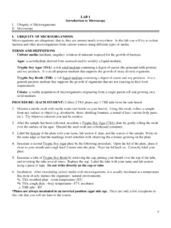
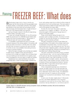
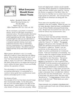
Transcription of Trendline Analysis in Excel
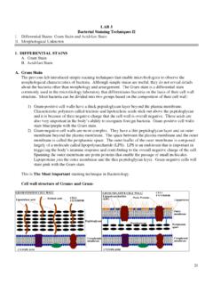
1 Trendline Analysis in Excel 2016. 1. General Information Trendline Analysis is a linear least squares regression tool that can be employed to provide some correlation to data points that are seemingly not linked at all. The Trendline Analysis package is a built-in Analysis tool in Excel . There are several types of Trendline correlation functions: Linear Fit Logarithmic Fit Polynomial Fit, with varying degree (2-6). Power Fit Exponential Fit Moving Average Fit, with varying period (2-15). 2. Getting Started The following set of data points will be used to demonstrate a linear fit of Trendline Analysis . Input Product (Gal/hr) (Lb/hr). 1 4. 2 7. 3 11. 4 18. 5 26. 6 32. 7 39. 8 45. 9 50. 10 52. 11 66. 12 75. 13 87. 14 91. 15 99. These data points are generally increasing with respect to X, but are far enough from linear to get a straight line connecting all points. This is where Trendline Analysis will give a best fit line that provides a reasonable approximation of the line connecting the data points.
2 An XY scatter graph of the above points looks like: 1. Concrete Production 100. 80. Output60. P lb/h40. 20. 0. 0 5 10 15. Input I gal/h 1. To utilize the Trendline Analysis tool, an XY Scatter graph must already be present . The graph above was created by selecting the two columns of data, clicking on the Insert tab, then in the Charts group click on the chart subtype scatter with only markers. To use the Trendline Analysis tool on the data points, the points themselves must be selected. To select the data points, first click anywhere on the graph. There should be a light blue boundary around the graph at this time notifying you that the graph has been selected. Now select the data points by right clicking once on one of the data points. After the data points have been selected, choose Add Trendline from the popup menu. A Format Trendline screen will appear and several options for fits will be presented along with an example of each.
3 Highlight the linear fit (it best approximates this set of data points). To display the equation of the line and/or the R-squared value of the line from the Format Trendline screen click in the box next to Display Equation on Chart, and/or Display R-squared Value on Chart. The label that will be assigned to the Trendline can also be edited by entering the desired text in the Custom box in the Trendline Name section. After all of the modifications have been made, click Close. The line that best approximates the given data set complete with the selected labeling and numerical values will appear on the original graph. The graph with the Trendline , and the labeling should appear and look like: 2. Concrete Production 100. y = - 50 R2 = Output P lb/h 0. 0 5 10 15. -50. Input I gal/h The position of the line equation and R-squared value on the graph can be changed by clicking on the text and dragging the text block with the mouse.
4 The accuracy of the fit can be interpreted using the R-squared value. As the R-squared value approaches 1, the accuracy of the fit approaches 100%. The following are some examples of the types of fits that Trendline will produce. Linear Fit: 100. 90. y = + 80. R2 = 70. 60. 50. 40. 30. 20. 10. 0. 0 2 4 6 8 10 12 14 16 18 20. 3. Logarithmic Fit: 25000. 20000 y = (x) - R2 = 15000. 10000. 5000. 0. 0 2 4 6 8 10 12 14 16 18 20. -5000. Polynomial Fit: (Second Order): 450. 400. 350 y = 2 + - 300 R2 = 250. 200. 150. 100. 50. 0. 0 2 4 6 8 10 12 14 16 18 20. Polynomial Fit (4th Order): 400. 350 y = 4 + 3 - 2 + - 300 R2 = 250. 200. 150. 100. 50. 0. 0 2 4 6 8 10 12 14 16 18 20. Exponential Fit: 4. 160. 140. 120. y = 100. R2 = 80. 60. 40. 20. 0. 0 2 4 6 8 10 12 14 16. Power Fit: 120. 100. 80. y = 60 R2 = 40. 20. 0. 0 2 4 6 8 10 12 14 16. Moving Average (Period 2): 120. 100. 80. 60. 40. 20. 0. 0 2 4 6 8 10 12 14 16. 5.