Transcription of What is a Pareto Chart? Why should teams use Pareto Charts?
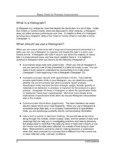
1 Basic Tools for Process Improvement2 Pareto CHARTWhat is a Pareto Chart? A Pareto chart is a series of bars whose heights reflect the frequency or impact ofproblems. The bars are arranged in descending order of height from left to right. This means the categories represented by the tall bars on the left are relatively moresignificant than those on the right [Ref. 5]. The chart gets its name from the ParetoPrinciple, which postulates that 80 percent of the trouble comes from 20 percent ofthe problems. Viewgraph 1 highlights the elements of this should teams use Pareto Charts? You can think of the benefits of using Pareto Charts in economic terms (Viewgraph2). A Pareto chart breaks a big problem into smaller pieces (and) identifies thebiggest contributors.
2 (It can) help us get the most improvement with the resourcesavailable by showing where to focus efforts in order to maximize achievements. ThePareto Principle states that a small number of causes accounts for most of theproblems. Focusing efforts on the vital few causes is usually a better use ofvaluable resources [Ref. 1a].When should we use a Pareto Chart? A Pareto chart is a good tool to use when the process you are investigatingproduces data that are broken down into categories and you can count the number oftimes each category matter where you are in your process improvement efforts, Pareto Charts can behelpful, .. early on to identify which problem should be studied, later to narrowdown which causes of the problem to address first. Since they draw everyone'sattention to the vital few important factors where the payback is likely to be greatest,(they) can be used to build consensus.
3 In general, teams should focus their attentionfirst on the biggest problems those with the highest bars [Ref. 5].Makingproblem-solvingdecisions isn t the only use of the Pareto Principle. SincePareto Charts convey information in a way that enables you to see clearly thechoices that should be made, they can be used to set priorities for many practicalapplications in your command. Some examples are:!Process improvement efforts for increased unit readiness!Skills you want your division to have!Customer needs!Suppliers!Investment opportunitiesPARETO CHARTVIEWGRAPH 1 What Is a Pareto chart ? Bar chart arranged in descendingorder of height from left to right Bars on left relatively more importantthan those on right Separates the "vital few" from the"trivial many" ( Pareto Principle) Pareto CHARTVIEWGRAPH 2 Why Use a Pareto chart ?
4 Breaks big problem into smaller pieces Identifies most significant factors Shows where to focus efforts Allows better use of limited resourcesBasic Tools for Process ImprovementPARETO CHART3 Basic Tools for Process Improvement4 Pareto CHARTHow is a Pareto chart constructed?To construct a Pareto chart , you need to start with meaningful data which you havecollected and categorized. You may want to turn to the Data Collection module atthis point to review the process of collecting and categorizing data that you can chart . Now you re ready to follow the steps for constructing a Pareto chart (Viewgraphs 3and 4). The steps below have been adapted from Joiner [Ref. 1b].Step 1 - Record the raw each category and its associated data 2 - Order the an analysis sheet, putting the categories in order and placing the one with the largest count 3 - Label the left-hand vertical sure the labels are spaced in equal intervals from 0 to a round number equal to or just larger than the total of allcounts.
5 Provide a caption to describe the unit of measurement being 4 - Label the horizontal axis. Make the widths of all of the bars the same and label the categories from largest to smallest. An "other" category can beused last to capture several smaller sets of data. Provide a caption to describethem. If the contributor names are long, label the axis A, B, C, etc. and provide 5 - Plot a bar for each height of each bar should equal thecount for that category. The widths of the bars should be 6 - Find the cumulative category's cumulative count is thecount for that category added to the counts for all larger 7 - Add a cumulative is optional. Label the right axis from 0 to 100%, and line up the 100% with the grand total on the left axis. For eachcategory, put a dot as high as the cumulative total and in line with the rightedge of that category's bar.
6 Connect all the dots with straight CHARTVIEWGRAPH 3 Constructing a Pareto ChartStep 1 - Record the dataStep 2 - Order the dataStep 3 - Label the vertical axisStep 4 - Label the horizontal axisStep 5 - Plot the barsPARETO CHARTVIEWGRAPH 4 Constructing a Pareto ChartStep 6 - Add up the countsStep 7 - Add a cumulative lineStep 8 - Add title, legend, and dateStep 9 - Analyze the diagramBasic Tools for Process ImprovementPARETO CHART5 Basic Tools for Process Improvement6 Pareto CHARTStep 8 - Add title, legend, and 9 - Analyze the for the break point on the cumulativepercent graph. It can be identified by a marked change in the slope of the graph(see Viewgraph 11). This separates the significant few from the trivial :Thesignificant few-trivial many principle does not always hold.
7 No matterhow many data are categorized, they can be ranked and made into a Paretodiagram. But sometimes no single bar is dramatically different from the others, andthe Pareto chart looks flat or gently sloping. To attack the tall bar in that situation isno help. You need to look for another way to categorize the let's look at an exampleto illustrate the Pareto chart construction process:You recently inherited $10,000 and would like to apply it to some of youroutstanding bills. Here is what you owe:Home improvement loan balance$1,956 Visa$2,007 Mastercard$1,983 Church building fund pledge (monthly installments of $ for two years)$2,000 Balance of car loan$1,971 School tuition (monthly installments of $ for one year)$2,030 Viewgraphs 5 and 6 show how this would look when recorded on an analysis sheetand plotted on a Pareto CHARTVIEWGRAPH 6 Pareto chart ExampleOutstanding DebtsLEGEND.
8 AMOUNT OWED ON OUTSTANDING DEBTS AS OF 12 FEB ,2002,4003,6004,8006,0007,2008,4009,6001 0,80012,000 TuitionVisa ChurchMCCarHomeType of DebtAmount Owed$ Pareto CHARTVIEWGRAPH 5 Analysis Sheet ExampleOutstanding DebtsCategoryAmount ($)School tuition (monthly installments)2,030 Visa2,0072,000 Church pledge (monthly installments)1,983 MastercardBalance of car loan1,971 Home improvement loan balance1,956 Total11,947 Basic Tools for Process ImprovementPARETO CHART7 Basic Tools for Process Improvement8 Pareto CHARTYou probably noticed that no single bar is dramatically different from the others. Looking at your outstanding debts in this way isn't much help. Is there a different waythe data could be categorized to make it more meaningful? What if you were toconsider the interest rates on your outstanding debts?
9 Viewgraphs 7 and 8 show what that would look like. A much clearer picture of youroutstanding debts now emerges, and you are able to make a better decision on how tomanage your :In this example, we opted not to show a cumulative line (Step 7) on the rightside of the Pareto chart because it might be confusing to create a percentage do we interpret a Pareto Chart? When you look at a Pareto chart , you can see break points in the heights of the barswhich indicate the most important categories. This information is useful when you areestablishing you can see in the example we've just looked at, you can detect two big breaks inthe heights of the bars when you categorize the data in a different way:!The first break point is between the second and third bars.
10 The differencebetween these two bars is much more noticeable than the other shows the relative importance of the first two bars in relation to theothers.!The other break point occurs after the fourth bar. Addressing the third andfourth bars will give a higher payoff than addressing the last two will have an opportunity to develop your interpretation skills when you do thepractice exercises that CHARTVIEWGRAPH 8 Pareto chart ExampleInterest Rates on Outstanding DebtsType of Tuition ChurchInterest RatesLEGEND: INTEREST RATES CHARGED ON OUTSTANDING DEBTS AS OF 12 FEB CHARTVIEWGRAPH 7 Analysis Sheet ExampleInterest Rates on Outstanding DebtsCategoryInt. Rate (%)MastercardHome improvement loan balanceSchool tuition (monthly installments)VisaBalance of car loan211892 Church pledge (monthly installments)16 Basic Tools for Process ImprovementPARETO CHART9 Basic Tools for Process Improvement10 Pareto CHARTHow can we practice what we ve learned?