Chapter 2 Graphical methods for presenting data
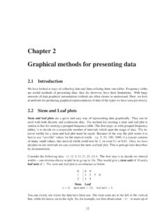
CHAPTER 2. GRAPHICAL METHODS FOR PRESENTING DATA 13 a stem unit of one 10 and a leaf unit one 1. It is important to give an equal amount of space to
Download Chapter 2 Graphical methods for presenting data

Information
Domain:
Source:
Link to this page:
Documents from same domain

Analysis of Covariance - Newcastle University
www.mas.ncl.ac.ukMedical Statistics course: MD/PhD students, Faculty of Medicine & MED819: ANCOVA 1 Analysis of Covariance 1. Introduction The Analysis of Covariance (generally known as ANCOVA) is a technique

Data Description, Populations and the Normal …
www.mas.ncl.ac.ukData Description, Populations and the Normal Distribution Introduction This course is about how to analyse data. It is often stressed that it may be totally

Calculating the mean and standard deviation on a calculator
www.mas.ncl.ac.ukMAS1403: Quantitative methods for Business Management Tutorial: Week 3 Calculating the mean and standard deviation on a calculator The following commands show how to calculate the mean and standard deviation by using the STAT

Chapter 6 Using Minitab - ncl.ac.uk
www.mas.ncl.ac.ukChapter 6 Using Minitab ... Programs– Statistical Software– Minitab 16 for Windows– Minitab 16. You should now have a spreadsheet (“data window”) ready to input data. In Minitab, there are two main windows; the Session window and the Worksheet window. The

1 Starting Minitab - Newcastle University
www.mas.ncl.ac.ukStart > All Programs > Minitab > Minitab 16 Statistical Software You will see two windows: a session window and a worksheet. Data are entered into columns labelled C1, C2, C3, etc in the worksheet. 2 Stem and leaf plots Suppose C1contains some data. To obtain a stem and leaf plot of these data you would need to do

Chapter 8 More Discrete Probability Models
www.mas.ncl.ac.ukCHAPTER 8. MORE DISCRETE PROBABILITY MODELS 82 of sixes on the 3 rolls, we have that X has a binomial distribution with parameters n = 3 and p = 1/6, that is

MAS3301 Bayesian Statistics Problems 3 and Solutions
www.mas.ncl.ac.uk(f) Plot a graph showing the prior and posterior probability density functions of on the same axes. (g) Find the posterior probability that <0:6: Notes: The probability density function of a beta(a;b) distribution is f(x) = kxa 1(1 x)b 1 where kis a constant. If X˘beta(a;b) then the mean of Xis E(X) = a a+ b and the variance of Xis var(X) = ab

1 Starting Minitab - Newcastle University
www.mas.ncl.ac.ukMAS1403: Quantitative Methods for Business Management Minitab supplement 6 Cumulative Frequency Polygons (Ogive) This graph can be produced using the following Minitabinstructions: 1. In column C1, enter the end points of the class intervals, as well as the starting point of the smallest class. 2.

Calculation of Positive Predictive Value
www.mas.ncl.ac.ukCalculation of Positive Predictive Value The positive predictive value (PPV) is the probability that an individual with a positive screening result (denoted +) has the disease (denoted D). The sensitivity is the probability that an individual with the disease is screened positive and the specificity is the probability that an
Related documents
LECTURE NOTES ON CONSTRUCTION PLANNING …
osp.mans.edu.egii TABLE OF CONTENTS CHAPTER 1: PROJECT PLANNING 1.1 Introduction 1 1.2 Project Planning Steps 2 1.2.1 Work Breakdown Structure (W BS) 3 1.2.2 …

Presenting Data with the DataGridView Control
ptgmedia.pearsoncmg.com218 CHAPTER 6: PRESENTING DATA WITH THE DATAGRIDVIEW DataGridView Overview The DataGridView control is a very powerful, flexible, and yet easy-to-use control for presenting tabular data. It is far more capable than the Data- Grid control and is easier to customize and interact with. You can let the
A Handbook of Statistical Analyses using SPSS
www.academia.dkPreface SPSS, standing for Statistical Package for the Social Sciences, is a powerful, user-friendly software package for the manipulation and statistical analysis of data. The package is particularly useful for students and researchers in

HOW CAN WE UNDERSTAND OUR WATER …
www.longwood.eduHOW CAN WE UNDERSTAND OUR WATER RESOURCES? ANALYZING EXPERIMENTAL DATA 6/13 Analyzing Experimental Data he information in this chapter is a short summary of some topics that are covered in depth in the book Students and Researchwritten by Cothron, Giese, and Rezba.
Chapter 18 HYDRAULIC SOFTWARE
www.sddot.comSouth Dakota Drainage Manual Hydraulic Software 18-3 18.2 SOFTWARE The software is grouped by Manual chapters. The software version that was available when the Manual was prepared is included. For current versions of software and
TABLES, CHARTS AND GRAPHS - …
www.surgicalcriticalcare.netTABLES, CHARTS, AND GRAPHS / 75 CHAPTER TWELVE TABLES, CHARTS, AND GRAPHS Tables, charts, and graphs are frequently used in statistics to visually communicate data. Such illustrations are also a frequent first step in evaluating raw data for trends, data entry errors, and outlying

Making Data Meaningful - UNECE
www.unece.orgMaking Data Meaningful Part 2: A guide to presenting statistics v Introduction The Making Data Meaningful guides have been prepared within the framework of the United Nations Economic Commission for Europe (UNECE) Work Sessions on the Communication and Dissemination of Statistics1, under the programme of work of the …
Related search queries
CHAPTER, Presenting Data with the DataGridView Control, PRESENTING DATA WITH THE DATAGRIDVIEW, For presenting, Data, A Handbook of Statistical Analyses using, UNDERSTAND OUR WATER, UNDERSTAND OUR WATER RESOURCES? ANALYZING EXPERIMENTAL DATA, Hydraulic, TABLES, CHARTS AND GRAPHS, TABLES, CHARTS, AND GRAPHS, TABLES, CHARTS, AND GRAPHS Tables, charts, and graphs, Making Data Meaningful, Making Data Meaningful Part 2, Presenting