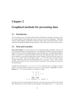
Chapter 2 Graphical methods for presenting data
Graphical methods for presenting data 2.1 Introduction We have lookedatways of collectingdataand thencollatingthem intotables. Frequency tables are useful methods of presenting data; they do, however, have their limitations. With large amounts of data graphical presentation methods are often clearer to understand. Here, we look
Download Chapter 2 Graphical methods for presenting data

Information
Domain:
Source:
Link to this page:
Documents from same domain

Analysis of Covariance - Newcastle University
www.mas.ncl.ac.ukMedical Statistics course: MD/PhD students, Faculty of Medicine & MED819: ANCOVA 1 Analysis of Covariance 1. Introduction The Analysis of Covariance (generally known as ANCOVA) is a technique

Data Description, Populations and the Normal …
www.mas.ncl.ac.ukData Description, Populations and the Normal Distribution Introduction This course is about how to analyse data. It is often stressed that it may be totally

Calculating the mean and standard deviation on a calculator
www.mas.ncl.ac.ukMAS1403: Quantitative methods for Business Management Tutorial: Week 3 Calculating the mean and standard deviation on a calculator The following commands show how to calculate the mean and standard deviation by using the STAT

Chapter 6 Using Minitab - ncl.ac.uk
www.mas.ncl.ac.ukChapter 6 Using Minitab ... Programs– Statistical Software– Minitab 16 for Windows– Minitab 16. You should now have a spreadsheet (“data window”) ready to input data. In Minitab, there are two main windows; the Session window and the Worksheet window. The

1 Starting Minitab - Newcastle University
www.mas.ncl.ac.ukStart > All Programs > Minitab > Minitab 16 Statistical Software You will see two windows: a session window and a worksheet. Data are entered into columns labelled C1, C2, C3, etc in the worksheet. 2 Stem and leaf plots Suppose C1contains some data. To obtain a stem and leaf plot of these data you would need to do

Chapter 8 More Discrete Probability Models
www.mas.ncl.ac.ukCHAPTER 8. MORE DISCRETE PROBABILITY MODELS 82 of sixes on the 3 rolls, we have that X has a binomial distribution with parameters n = 3 and p = 1/6, that is

MAS3301 Bayesian Statistics Problems 3 and Solutions
www.mas.ncl.ac.uk(f) Plot a graph showing the prior and posterior probability density functions of on the same axes. (g) Find the posterior probability that <0:6: Notes: The probability density function of a beta(a;b) distribution is f(x) = kxa 1(1 x)b 1 where kis a constant. If X˘beta(a;b) then the mean of Xis E(X) = a a+ b and the variance of Xis var(X) = ab

1 Starting Minitab - Newcastle University
www.mas.ncl.ac.ukMAS1403: Quantitative Methods for Business Management Minitab supplement 6 Cumulative Frequency Polygons (Ogive) This graph can be produced using the following Minitabinstructions: 1. In column C1, enter the end points of the class intervals, as well as the starting point of the smallest class. 2.

Calculation of Positive Predictive Value
www.mas.ncl.ac.ukCalculation of Positive Predictive Value The positive predictive value (PPV) is the probability that an individual with a positive screening result (denoted +) has the disease (denoted D). The sensitivity is the probability that an individual with the disease is screened positive and the specificity is the probability that an
Related documents
Visual Basic Programming - Baylor ECS
cs.baylor.eduH Other Graphical User Interfaces (GUI) are no better. H Visual Basic provides a convenient method for building user interfaces. H Visual Basic can interface with code written in C, for efficiency. What Visual Basic is not H Visual Basic is not, a powerful programming language that enables you to

Employee Management System - DiVA portal
lnu.diva-portal.orgThis report includes a development presentation of an information system for managing the staff data within a small company or organization. The system as such as it has been developed is called Employee Management System. It consists of functionally related GUI (application program) and database.
DATA ANALYSIS, INTERPRETATION AND PRESENTATION
www.uio.no• Graphical representations (as discussed above) may be appropriate for presentation • Other techniques are: –Rigorous notations, e.g. UML –Using stories, e.g. to create scenarios –Summarizing the findings

Interpretation of forest plots Part I
volunteer.heart.orgForest plots are graphical representations of the meta-analysis. The word originated from the idea that graph had a forest of lines. The plot originated in the early eighties although the term forest plot was coined only in 1996. Forest plots in their modern form originated in 1998. 3 .
PowerPoint Presentation - Operating Systems
www.uvtagg.orgoperating systems are “graphical user interfaces” or GUI’s. GUI is defined as: A picture used in place of a word or words to issue commands. GUI – Standards ... PowerPoint Presentation - Operating Systems ...