Chapter 2 Graphical methods for presenting data
CHAPTER 2. GRAPHICAL METHODS FOR PRESENTING DATA 16 2.2.1 Using Minitab With the small data sets we have seen so far, it is obviously relatively easy to create stem and leaf plots by hand. With larger data sets this would be more problematic and certainly more time consuming. Fortunately, there are computer packages that will create these plots ...
Download Chapter 2 Graphical methods for presenting data

Information
Domain:
Source:
Link to this page:
Documents from same domain

Analysis of Covariance - Newcastle University
www.mas.ncl.ac.ukMedical Statistics course: MD/PhD students, Faculty of Medicine & MED819: ANCOVA 1 Analysis of Covariance 1. Introduction The Analysis of Covariance (generally known as ANCOVA) is a technique

Data Description, Populations and the Normal …
www.mas.ncl.ac.ukData Description, Populations and the Normal Distribution Introduction This course is about how to analyse data. It is often stressed that it may be totally

Calculating the mean and standard deviation on a calculator
www.mas.ncl.ac.ukMAS1403: Quantitative methods for Business Management Tutorial: Week 3 Calculating the mean and standard deviation on a calculator The following commands show how to calculate the mean and standard deviation by using the STAT

Chapter 6 Using Minitab - ncl.ac.uk
www.mas.ncl.ac.ukChapter 6 Using Minitab ... Programs– Statistical Software– Minitab 16 for Windows– Minitab 16. You should now have a spreadsheet (“data window”) ready to input data. In Minitab, there are two main windows; the Session window and the Worksheet window. The

1 Starting Minitab - Newcastle University
www.mas.ncl.ac.ukStart > All Programs > Minitab > Minitab 16 Statistical Software You will see two windows: a session window and a worksheet. Data are entered into columns labelled C1, C2, C3, etc in the worksheet. 2 Stem and leaf plots Suppose C1contains some data. To obtain a stem and leaf plot of these data you would need to do

Chapter 8 More Discrete Probability Models
www.mas.ncl.ac.ukCHAPTER 8. MORE DISCRETE PROBABILITY MODELS 82 of sixes on the 3 rolls, we have that X has a binomial distribution with parameters n = 3 and p = 1/6, that is

MAS3301 Bayesian Statistics Problems 3 and Solutions
www.mas.ncl.ac.uk(f) Plot a graph showing the prior and posterior probability density functions of on the same axes. (g) Find the posterior probability that <0:6: Notes: The probability density function of a beta(a;b) distribution is f(x) = kxa 1(1 x)b 1 where kis a constant. If X˘beta(a;b) then the mean of Xis E(X) = a a+ b and the variance of Xis var(X) = ab

1 Starting Minitab - Newcastle University
www.mas.ncl.ac.ukMAS1403: Quantitative Methods for Business Management Minitab supplement 6 Cumulative Frequency Polygons (Ogive) This graph can be produced using the following Minitabinstructions: 1. In column C1, enter the end points of the class intervals, as well as the starting point of the smallest class. 2.

Calculation of Positive Predictive Value
www.mas.ncl.ac.ukCalculation of Positive Predictive Value The positive predictive value (PPV) is the probability that an individual with a positive screening result (denoted +) has the disease (denoted D). The sensitivity is the probability that an individual with the disease is screened positive and the specificity is the probability that an
Related documents
A First Course in Design and Analysis of Experiments
users.stat.umn.eduA First Course in Design and Analysis of Experiments Gary W. Oehlert University of Minnesota
1 Starting Minitab - Newcastle University
www.mas.ncl.ac.ukMAS1403: Quantitative Methods for Business Management Minitab supplement 6 Cumulative Frequency Polygons (Ogive) This graph can be produced using the following Minitabinstructions: 1. In column C1, enter the end points of the class intervals, as well as the starting point of the smallest class. 2.
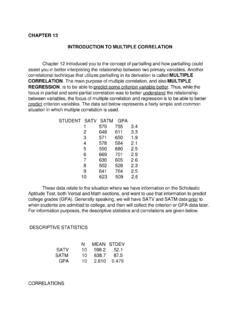
CHAPTER 13 INTRODUCTION TO MULTIPLE CORRELATION …
www.personal.psu.edu6 669 701 2.9 7 630 605 2.6 8 502 528 2.3 9 641 764 2.5 10 623 509 2.6 These data relate to the situation where we have information on the Scholastic Aptitude Test, both Verbal and Math sections, and want to use that information to predict

SCHAUM'S OUTLINE OF THEORY AND PROBLEMS OF …
uobabylon.edu.iqcalled Minitab (Minitab Inc., 3081 Enterprise Drive, State College, PA 16801-3008). I wish to thank Minitab Inc. for granting me permission to include Minitab output, including graphics, throughout the text. Most modern Statistics textbooks include computer software as part of the text. I have chosen to include Minitab
4 Solutions to Exercises - Web.LeMoyne.Edu
web.lemoyne.edu†For statistical analysis: Minitab, G†Power, JMP IN, and GLMStatÑthe latter two mostly for the Chapters 14 and 15. George McCabe supplied output from SAS for Chapter 15. G†Power is available as freeware on the Internet, while GLMStat is share-ware. Additionally, I used the TI-82, TI-85, TI-86, and TI-92 calculators from Texas Instruments.

Chapter 2 Simple Comparative Experiments Solutions
www.acc.umu.seChapter 2 Simple Comparative Experiments ... Minitab Output T-Test of the Mean Test of mu = 120.00 vs mu > 120.00 Variable N Mean StDev SE Mean T P Shelf Life 10 131.00 19.54 6.18 1.78 0.054 T Confidence Intervals . Solutions from Montgomery, …
Getting Started with Minitab Statistical Software
www.minitab.comThe Minitab user interface 4 Data types 6 Open and examine a worksheet 7 In the next chapter 7 2 Graphing Data 8 Overview 8 Create, interpret, and edit histograms 8 Create and interpret scatterplots 13 Arrange multiple graphs on one layout 16 Save a Minitab project 19 In the next chapter 20 3 Analyzing Data 21 Overview 21 Summarize the data 21

Scatter Diagrams Correlation Classifications
www.stat.colostate.eduChapter 5 # 6 Linear Correlation • Negatively correlated variables vary as opposites • As the value of one variable increases the other decreases 0 10 20 30 40 4 3 2 Regression Plot Hours Worked Student GPA Chapter 5 # 7 Strength of Correlation • Correlation may be strong, moderate, or weak. • You can estimate the strength be observing the