
Create a Grade Distribution Graph in Excel
distribution graph in Excel Export gradebook Export your Canvas gradebook as a CSV file. Create grade distribution graph 1. Open the file in Excel. 2. Select the whole spreadsheet. 3. On the Menu Task Bar, select Insert > Recommended PivotTables. 4. Select the table that offers “Final Grades as Row” and “Count of Students” as values.
Download Create a Grade Distribution Graph in Excel

Information
Domain:
Source:
Link to this page:
Documents from same domain

Foundations for learning: Relationships between the …
cpb-ap-se2.wpmucdn.comFoundations for learning: Relationships between the Early Years Learning Framework and the Australian Curriculum AN ECA!ACARA PAPER | 1 Foundations for learning
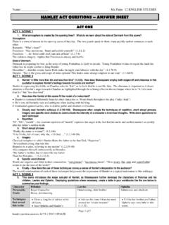
HAMLET ACT QUESTIONS – ANSWER SHEET
cpb-ap-se2.wpmucdn.comPage 3 of 5 hamlet question answers ACTS 1 TO 5 UPDATE ACT 3 QUESTIONS ACT 3 SCENE 1 10. The “To be or not to be” soliloquy 3.1. 56-89) is considered one of the most famous speeches by Shakespeare.

TEAL Writing Assessment Criteria TASK 10: The future me ...
cpb-ap-se2.wpmucdn.comTEAL Writing Assessment Criteria TASK 10: The future me Name: _____ Date:_____ conventions Communication Cultural Writing Linguistic structures and features Strategies AusVELS EAL ... modal verb forms pronoun references correct letter forms correct spelling of familiar words phonetic spelling variable punctuation

OF MICE AND MEN - St Leonard's College
cpb-ap-se2.wpmucdn.comThe best laid schemes o' Mice an' Men, the best-laid schemes of Mice and Men Gang aft agley, go oft awry, An' lea'e us nought but grief an' pain, and leave us only grief and pain, For promis'd joy! for promised joy! Still, thou art blest, compar'd wi' …
Patterns and Algebra F - cpb-ap-se2.wpmucdn.com
cpb-ap-se2.wpmucdn.comSIS TOI F 1 3 opiht eai Pattens an ea There are 2 different types of rules that a number pattern can be based upon: 1 A recursive rule – used to continue the sequence by doing something to the number before it. 2 A function rule – used to predict any number by applying the rule to the position of the number. A function rule is a rule based on the position of a number.

Electricity – Exam type questions
cpb-ap-se2.wpmucdn.comUnit 1 Physics 2017 Electricity Page 1 of 25. Electricity – Exam type questions . The resistance of a certain piece of wire is found to be 0.8 . Ω. What would be the resistance of Question 11 a piece of the same wire 3 times as long? A Ω 0.27 . B. 0.8. Ω. C . 2.4 . Ω. D . 7.2 . Ω. Question 12 two pieces of the same wire side by side? A ...

A Streetcar Named Desire - St Leonard's College
cpb-ap-se2.wpmucdn.comOverview •Plot: Concerned with Blanche’s arrival, her dreams and desires, and eventual break down. •Context: Premiered in 1947, into a world that was looking forward into the future after WWII. It enjoyed 855 performances in its first run, and won all 3 …

Learning Intentions and Success Criteria
cpb-ap-se2.wpmucdn.comintended curriculum based on deep knowledge of the student, the learning continuum (all areas) and professional practice reflecting agreed contemporary pedagogies. It incorporates structures to include student voice in the co-design. Personalised learning at the achieved level is the attainment of each student’s

Lenses for Reading Literature
cpb-ap-se2.wpmucdn.comMaking Literature Matter for definitions and examples. 1. Ethnicity/Race/Culture: This lens allows us to look at issues/conflicts/questions that arise in a text that relate to the ethnicities, races, and cultures of the characters in the text. It is particularly
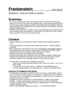
Chapter 8 ~ Trial and Death of Justine
cpb-ap-se2.wpmucdn.com• Feminism was a new idea and wasn’t socially accepted • Science and education was intended for men only, whereas childbirth, childcare, and ... -showing values of the time, that it was more important for Justine to be accepted in ... once that is lost their whole character is tainted.
Related documents

Word and Excel Practice Exercise
engineering.queensu.cayour graph. 2. Do include axis titles (with units). 3. Eliminate/Reduce horizontal and vertical gridlines when appropriate. Horizontal and vertical gridlines should only be included if they highlight key data points or are critical for making your graph more legible. 4. Avoid using colour where possible. 5.
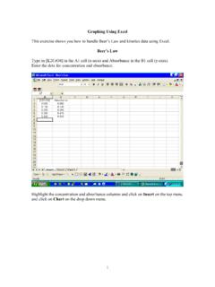
Graphing in Excel - Community College of Rhode Island
www.ccri.eduGraphing Using Excel This exercise shows you how to handle Beer’s Law and kinetics data using Excel. Beer’s Law Type in [K2CrO4] in the A1 cell (x-axis) and Absorbance in the B1 cell (y-axis). Enter the data for concentration and absorbance. Highlight the concentration and absorbance columns and click on Insert on the top menu

TA Excel による実験データのグラフ化 - Osaka U
www.library.osaka-u.ac.jpExcel に様々なグラフの種類があるが実験データの図示には 「散布図」が最もふさわしい。 「折れ線」を選ばないように注意 理由:「折れ線」は横軸が固定されてしまう 図には必ずタイトルをつけること。

Checking normality in Excel
www.sheffield.ac.ukExcel will not perform non-parametric tests even with the data analysis toolpak add in. Both AI-therapy and the ‘Real-Statistics’ add in will though. Using the data analysis toolpak . Although this is a standard Excel add in package, you will need to add it via File > Options > Add-Ins (see ‘Additional toolpaks in Excel’ sheet for details).

How to create graphs with a “best fit line” in Excel
www.utsa.eduHow to create graphs with a “best fit line” in Excel . 2In this manual, we will use two examples: y = x, a linear graph; and y = x, a non-linear graph. The y-values were specifically chosen to be inexact to illustrate what you will see when you analyze data from your labs.

Trendline Analysis in Excel - Laramie, Wyoming
www.uwyo.edu2 n 0 20 40 60 80 100 0 5 10 15 t h t h 1. To utilize the Trendline Analysis tool, an XY Scatter graph must already be present. The graph above was created by selecting the two columns of data, clicking on the Insert tab, then in the Charts group …