Transcription of AP STATISTICS EXAM REVIEW - Frankumstein
1 AP STATISTICS REVIEW (YMS Chapters 1-8) Exploring Data (Chapter 1) Categorical Data nominal scale, names male/female or eye color or breeds of dogs Quantitative Data rational scale (can +, , , with numbers describing data) weights of hamsters or amounts of chemicals in beverages A. Graphing one variable (univariate) data ALWAYS PLOT DATA 1. Categorical data Bar graphs (bars do not touch) Pie charts (percentages must sum to 100%) 2. Quantitative data label carefully Dot plots can resemble probability curves Stem (& leaf) plots remember to put in the key ( 8|2 means 82 mg.)
2 Of salt) Split stems if too many data points Back to back for comparison of two samples Histogram put // for breaks in axis, use no fewer than 5 classes (bars), check to see if scale is misleading, look for symmetry & skewness Ogive cumulative frequency plot Time plot used for seasonal variation where the x-axis is time Box plot modified shows outliers Side by side are good for comparing quartiles, medians and spread B. Summary STATISTICS for one variable data (use calculator with 1-variable stats) 1. Measures of central tendency (center) mean ( ,x) median (middle) mode (most) 2.
3 Measures of dispersion (spread) range (max min) quartile (25% = Q1, 75% = Q3) interquartile range (Q1 Q3) variance 2222)(1)(nxornxxsii = = standard deviation square root of variance (s, ) Mean, range, variance, and standard deviation are non resistant measures (strongly influenced by outliers). Use variance and standard deviation with approximately normal distributions only. Remember: the mean chases the tail. The normal Distributions (Chapter 2) 1.
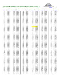
4 If the mean = 0 and the standard deviation = 1, this is a standard, normal curve 2. Use with z scores (standard scores), z = x, where +z are scores are above the mean and z are scores below the mean. 3. To compare two observations from different circumstances, find the z score of each, then compare 4. Use z scores to find the p value, the probability (or proportion or percent) of the data that lies under a portion of the bell curve, p values represent area under the curve. Use shadenorm and normalcdf (to find the p value), or invnorm (to find z score) on the calculator 5.
5 ALWAYS DRAW THE CURVE and shade to show your area. 6. 68% 95% rule for area under the curve Examining Relationships (Chapter 3) A. Graphing two variable (bivariate) data DATA MUST BE QUANTITATIVE. Graph the explanatory variable (independent) on the x axis, the response variable (dependent) on the y axis 1. Scatterplots look for relationships between the variables. 2. Look for clusters of points and gaps. Two clusters indicate that the data should be analyzed to find reasons for the clusters.
6 3. If the points are scattered, draw an ellipse around the plot. The more elongated, the stronger the linear relationship. Sketch the major axis of the ellipse. This is a good model of the linear regression line. B. Analyzing two variable quantitative data when a linear relationship is suggested 1. Linear correlation coefficient (r) measures the strength of the linear relationship 11 r r = 0 indicates no relationship (the ellipse is a perfect circle) r indicates an inverse relationship r is a non resistant measure (outliers strongly affect r) r =))((11yixisyysxxn (use calculator with 2 variable stats) 2.
7 Least squares regression line (LSRL) used for prediction; minimizes the vertical distances from each data point to the line drawn. (Linreg a+bx) y varies with respect to x, so choose the explanatory and response axes carefully (y is dependent on x) predicted y value =y a + bx is the equation of the LSRL where b = slope = r=y )(xyss and the point (),yx is always on the line. Do not extrapolate (predict a y value when the x value is far from the other x values). 3. Coefficient of Determination (r2) gives the proportion (%) of variation in the values of y that can be explained by the regression line.
8 The better the line fits, the higher the value of r2. To judge "fit of the line" look at r and r2. If r = , then r2 = .49, so about half the variation in y is accounted for by the least squares regression line. 4. Residual (y y ) vertical distance from the actual data point to the regression line. y y = observed y value predicted y value where residuals sum to zero Residual plot scatterplot of (observed x values, predicted y values) or (x, ).
9 Use calculator to y plot residuals on y axis, original x values on x axis. Check: no pattern good linear relationship, curved pattern no linear relationship, plot widens larger x values do not predict y values well Outliers y values far from the regression line (have large residuals) Influential points x values far from the regression line (may have small residuals) More on Two-Variable Data (Chapter 4) A. Analyzing two variable quantitative data when the data is in a curved pattern: If the data appears curved in the shape of a power function or an exponential function, or or , use the calculator to fit an appropriate function to the data.
10 B. Check for exponential regression 1. Take the log of the original y data (in your list) 2. Replot the data (x, log y); it will look linear 3. Calculate a least squares regression line as if the transformed data was original data. Remember that the regression equation is now in the form log=y a + bx. 4. Verify with residual plot (no pattern) 5. Remember to undo the transformation before making a prediction using the regression line. C. Check for power regression 1. Take the log of both the original x and original y data (in your lists) 2. Replot the data (log x, log y); it will look linear 3.
