Transcription of Biology statistics made simple using Excel
1 School Science Review, December 2001, 83(303)23 MillarBiology statistics made simple using ExcelBiology statistics madesimple using ExcelNeil MillarSpreadsheet programs such as Microsoft Excel can transform the use ofstatistics in A-level scienceABSTRACTM odern spreadsheet software, such as MicrosoftExcel, can transform the use of statistics inbiology. Instead of being difficult to do and tointerpret, statistical tests become simple to doand much easier to interpret. This article des-cribes when and how to carry out many of themost common tests (including mean, standarddeviation, confidence limits, correlation, regress-ion, t-test, 2-test and ANOVA) using is an area that most A-level Biology students(and their teachers!) find difficult. The formulae areoften complicated, the calculations tedious, degreesof freedom mysterious, and probability tablesconfusing.
2 But in fact students need no longer grapplewith any of these. In real life, biologists andstatisticians rarely use calculation and tables thesedays, but instead use statistical packages such asMinitab or SPSS. But it isn t even necessary to buyan expensive statistics package, since spreadsheet soft-ware such as Excel has most of the common statisticaltests using statistics , the first hurdle is to decidewhich statistical test to use. Figure 1 (overleaf) is aflow chart showing when to use the various testsdescribed in this article. There are many other possiblestatistical tests, but this flow chart should be morethan sufficient for A-level Biology students. It brieflysummarises the Excel formulae and how to interpretthe results, so it can be used as a handy guide on itsown once the student is familiar with the tests.
3 Thisflow chart should be used when designing anexperiment, not after the experiment is complete. Thiswill ensure that the correct kind of data are collectedso that the statistical test will be valid. The rest of thearticle describes in detail how to carry out these testsusing Excel and how to interpret the results. It isdivided into five sections:1 Descriptive statisticsmean, median, modestandard deviation,standard error,confidence interval2 Graphing datascatter graphs, bargraphserror bars, lines3 Association statisticsPearson coefficient,Spearman coefficientlinear regression4 Comparative statistics paired and unpairedt-testMann-Whitney U-testANOVA5 Frequency statistics 2-test 2-test of association1 Descriptive statisticsMost school Biology experiments will involve somekind of measurement, such as time, length, mass,temperature, absorbance, etc.
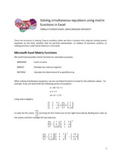
4 , and in a well-designedexperiment there should be a number of repeats (orreplicates) of each measurement. Once some measure-ments have been collected the first job is usually tosummarise them using descriptive statistics . Excel hasformulae for the three measures of the centre of adistribution of arithmetic mean is given by the formula:=AVERAGE (range)The median is given by the formula:=MEDIAN (range)And the mode is given by the formula:=MODE (range) Biology statistics made simple using ExcelMillar24 School Science Review, December 2001, 83(303)Figure 1 Flow chart used to choose an appropriate statistical Science Review, December 2001, 83(303)25 MillarBiology statistics made simple using ExcelThese formulae are illustrated in Figure 2. In manycases the quantities measured in Biology will show anormal distribution, and so the mean is the most appro-priate statistic to use.
5 It is also the one students aremost likely to know already, and to be able to do byhand. The median and mode are less likely to beneeded for experimental data, but some A-level speci-fications require a knowledge of them. It is unfortunatethat Excel uses the word average for mean , as sometextbooks use average as a general term to refer toany measure of the centre of a statistician will tell you that there is no point incalculating a mean without also calculating somemeasure of the variation or spread of the measure-ments, but students often don t bother because of thedifficulty of the calculations. Figure 2 shows fivedifferent measures of the spread, and shows how easythey are to calculate using Excel . The range is given by the Excel formula:=MAX (range) - MIN (range)This is the simplest, but least useful.
6 The variance is given by the Excel formula: =VAR (range)This is used in calculations, but has little use as adescriptive statistic since it is not in the same unitsas the measurements. The standard deviation (SD) is given by the Excelformula:=STDEV (range)This is common (since it is fairly easy to calculateby hand) and it gives a good indication of thevariability of a set of data. However it is not thebest statistic to use when comparing different setsof data, especially if the data sets are differentsizes. The standard error of the mean (SE) is given bythe formula: =STDEV (range) / SQRT (COUNT (range))This gives an indication of the confidence of themean, and is often used as an error measurementsimply because it is small rather than for any goodstatistical reason. The 95% confidence interval (CI) is given by theformula: =CONFIDENCE ( , STDEV (range), COUNT (range))Figure 2 Eight descriptive statistics .
7 The MODE formula returns #N/A because no values are duplicated, sothere is no modal value in these data. Note that Excel will always return the results of a calculation to about 8decimal places. This is usually meaningless, and cells with calculated results should always be formatted to amore sensible precision (Format menu > Cells > Number tab > Number). Biology statistics made simple using ExcelMillar26 School Science Review, December 2001, 83(303)The value of is used to give the 95% ( )confidence interval, and different values can beused for different levels of confidence, such for a 99% confidence interval. There is a 95%probability that the true mean lies within CI fromthe measured mean, and the upper and lowervalues of this range are called the these five, the 95% confidence interval is the mostuseful measure of the dispersion of data around themean, and also the easiest to understand.
8 It is not aswell known as the others because it is so difficult tocalculate, but using Excel it is no more difficult tocalculate than the others. It is the preferred statistic touse when comparing different sets of data, and whendrawing error bars on a graph. Students should alwaysbe encouraged to calculate a CI whenever theycalculate a mean, and to refer to it whenever theyevaluate their data. If the CI is small compared to themean then the mean is reliable, but if the CI is largecompared to the mean then the mean is unreliable. InFigure 2 the two sets have the same means butdifferent spreads, and the statistics all show that thedata in group A have a smaller spread and are thereforemore reliable than those in group Graphing dataGraphs are an important part of data analysis and areclosely connected to statistics , since the choice ofgraph is connected to the choice of statistical test, asthe flow chart in Figure 1 shows.
9 If you are investigat-ing an association between two variables, then youshould plot a scatter graph; if you are comparingdifferent sets of data, you should plot a bar graph;and if you are collecting frequency data, then you mayplot a bar or pie chart, or a graph may not beappropriate. In Excel it is quite easy to plot thesegraphs, as well as many other types. First enter thedata into columns or rows, and select them. Then clickon the chart wizard (or Insert menu > Chart). Thiswizard has four steps:1In Graph Type, select the type you want and pressNext. Choose Column for bar charts or XY(Scatter) for line and scatter graphs. Do notchoose Line , which plots the data against rownumber. This is a very common Source Data, if the sample graph looks aboutright, then just press Next.
10 If it looks wrong, youcan correct it by clicking on the series tab, andthen the red arrow at the end of the X Values highlight the cells containing the X data inthe spreadsheet and press the red arrow for the Y Values Chart Options, the most important tasks are totype in suitable titles for the graph and the twoaxes. You can also turn off gridlines and legend,which makes the chart look Graph Location, just press Finish. This putsthe chart beside the data so you can see graphs are quite flexible and almost everythingabout them can be changed. Just double-click (orsometimes right-click) on the part you want to example, you can move and re-shape the graph;change the background colour (white is usually best);change the shape and size of the markers (points);join the points; change the axes scales and tick marks;or add a trend line or error bars.