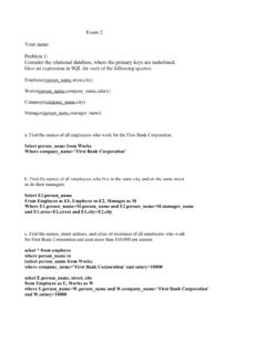
Transcription of Chapter 7 Color and Graphics - Kent State University
1 Chapter7 Colorand GraphicsIncreasingly, peopleaccessthe Web withhighquality ,colorsandcolorgraphicsare an important dimensionsof howtheycan be usedto enhancevisualcommunicationis the rststepin the e ective use ofcolorin site ,like many otherdesignfactors,appearsdeceptively simpleto in numeroussoftware packageson the market. Colorcan be selected,spilled,painted,air brushed,or lteredin virtuallyevery Color ,wildcolor,patternandtexturedcolor{ itseverywhere,and mostof us have been exposedto it sincewe were , to crayons,to the craftproject in juniorhigh,to paintinga room in ourhouse,mostof us have worked withcolorin one way or not artists,theyoftensay, \I can'teven draw astick gure."No one ever says \I don'treallyknow anythingabout Color ."Thisassumedknowledgecan oftenleadto poor colorchoicesby ,this odd breedofprofessionalswhoare oftenthrown into the generalmix withother\artists,"such as sculptorsor painters,are usuallynot born withan innatesenseof ,mostdesignersare formallytrainedto understandcolorandits meaningin ,combinedwithcommunication,is at the root of purelyaestheticreasonsis a luxuryawardedto actualartists,whodo not necessarilyhave to answer305306 CHAPTER7.}
2 COLORANDGRAPHICSto the public,much less a payingclient. Designers,on the otherhand,have to do just that{articulateand defendtheircolorchoicesand its introducesbasiccolortheoriesandrelatesth emto basicto creatingand manipulatinggraphicalimagesfor you readthroughthe sections,keep in mindthatcoloris a highlysubjective areafor mostclients, whohave speci ccolorpreferencesand ndit di cultto compromiseonthis aspect of a will have to give this mattercarefulconsiderationif you runinto this problem{be preparedto HistoricalNoteon ColorTheoryOver the years,scientistsand artistshave studiedwhy humanbeingsrespond to ,colorpreferencescan be very subjectiveand dimensionof di culty for formulatingtheoriesabout andexperimentationbeganwiththe development of the colorwheel( ).Thesetheoriescontinued to evolve over decadesto explainparticularpatternsand ,Goethe,Holzeand Albers whoexplainedbothmeasurablecolorattribute s(colorimetry)and subjective to any colortheoryis the ability to distinguishcolorsand give 'ssay you selecteda yellow.}}
3 Is it a brown mustardyellow or a bright sunshineyellow? Even thoseare imprecisedescriptionssubject to interpretationby actuallypinpoint any particularcolorwithoutambiguity?In the 1990s,Albert HenryMunsell,an art professorin Boston(USA),developed oneof the mostin uential Color -modelingsystemsanda notationfor 'ssystemidenti edthreeindependent components of Color : Hue|Accordingto Munsell,hue is \thequality by which we distinguishone colorfromanother."Light withdi erent hues have di erent oftenusedinterchangeablyin we will try to avoidBrooks/Colebook/January28, Value|\Thequality by which we distinguisha light colorfroma darkone."It mea-sureshowbrightordarka coloris. At full value(brightness)a colorof any hue zerovalue(no brightness),any colorappearsblack. Chroma|Therichnessof hue. It di erentiatesdeepbluefrompaleblue,for also known as the Color 'ssaturation.
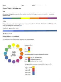
4 Addingwhitepaint to red reducesitssaturationor chromamakingit colorat full saturationis a purehue. A colorat zerosaturationis a shadeof developed a systemto quantify Hue,Value,and Chromamakingit systemhas been adaptedby Pantonein theircolormatchingsystemas well as by TRUEMATCHor CIEsystemsand the rstto realizethe harmony in colorpairsaccordingto de nedand identi edstrategiesfor : Primary, Secondary, and TertiaryColorsAs mostof us remember fromearlychildhood, thereare threeprimaryhuesred,yellowand blue( ) thatcan combineto obtainall example,green=yellow + blue,orange= yellow + red, and purple= blue+ theSecondaryhues( ).Tertiarycolorsare yellow-orange,red-orange,red-purple,blue -purple,blue-greenand createdby mixingsecondarycolors( ).Brooks/Colebook/January28, 2003308 CHAPTER7. : ColorWheelIn 1666,Sir IsaacNewtondeveloped the rstcircularcolordiagram,and sincethattime,the traditionalcolorwheelhave evolved many variations( ).
5 Generally, a colorwheelis a diagramthatrepresents colorhues and theirinterrelationshipsin a primaryand secondaryhues, thenshow a chromaticrelationshipbetween ,warm,high-saturation,brightcolorsappear to comeforward and are saidto be active. Cool, low-saturation,darkcolorsappear to visuallyrecedeand are saidto be passive. Somecolorsappear to be general,humanbeingsrespondstronglyto stronglikes anddislikes whenit comesto theirpreferences,mostpeoplerespond positivelyto the harmonioususe of may be de nedas a pleasingarrangement of partssuch as in innersenseof order,a visualbalance,whichengagesthe viewer. Colorharmony impliesthatcolorsceneis neitherboringnor indicatedby the principleof unity and variety ( ),it is important to know howmuch andwhatcolorsto includein a you don'tincludeenoughcolor,you runthe riskof boringthe viewer. On the otherhand,if you overwhelmthe viewer withtoomuch Color ,the visualsmay not make any betterisn'tBrooks/Colebook/January28, good one sincecolor,like any otherelement in design,has to be usedfor a reason,andit has to make sensein the rejectwhatitdoesn' much of design,harmoniouscoloris subjective andin the nalanalysis,colorchoicessometimescomedow n to whatthe client likes or dislikes.
6 Despiteitssubjectivity, thereare somegeneralprinciplesfor usingcoloror to do withunderstandingcolorcontrast,complemen t, analogy, and : HueContrast-ValueContrastJustlike for contrastof forms( ),the gure-groundrelationshipis importantfor contrastin erencebetween a subject (or gure)and its surrounding eld(ground)createscontrast{themorecontra stbetween a gureand the ground,the morevisibleit colorcomesin two basicvarieties,valuecontrast(light vs. darkcolor)andhue contrast(di erencein colorhue).Butthereis moreto his twowell-known books,\TheArt of Color "and \TheElements of Color ,"Ittenwritesabout thee ectivenessof colorrelationshipswithrespect to seven distinctcolorcontrastsas we'll ' hue|Di erencebetween hues such as yellow, blueand red ( ).Brooks/Colebook/January28, 2003310 CHAPTER7. : Low, Moderate,and HighHueContrastsThecontrastis formedby the juxtapositionof di erent distancebetween hues on a colorwheel,the greaterthe shows low, moderateand highhue : Contrast:Warmth, Saturation,and |black and white,night and day, darkgray and light formedby the juxtapositionof light ective as shows di erent : Light, Mdeium,and DarkValuesBrooks/Colebook/January28, |red,orangeyellow (warm)contrastedwithblue,greenandbrown (cool).}
7 See |opposingcolorson the colorwheelwhich createmaxi-mum contrast;yellow, violet,blue,orange,red,green( ). : Contrast:Simultaneousand |contrastwhenthe boundariesbetween colorsperceptuallyvibratesometimescreati nginterestingillusions( ).Thisis an e ectthatoccurswhentwo adjacent colorsenhanceor reducetheiropticsaturation: Whitelooks whiterwhensurroundedby darker value. Gray appearsmoreintensewhensurroundedby lighter value. Colorscan appear lighter or darker dependingon saturation|contrastbetween pure,intensecolorsandmoreneutral, extension|involves assigningnumericpropertiesto colorand thenusingthemin weighingproportionalamounts nextto one , 2003312 CHAPTER7. COLORANDGRAPHICSA nalogousColorsAnalogouscolorsare any threecolorswhich are side-by-sideon a 12-partcolorwheelsuchas green,yellow-greenand yellow. Thistype of coloris oftenfoundin natureand it tendsto be pleasingto the eye ( ).
8 :Analogousand :ComplementaryColorExamplein PaintingBrooks/Colebook/January28, two colorsthatare directlyoppositeto each otheron thecolorwheel,such as red andgreenandorangeandblue( ).Complementarycolorsgenerallylook very well togetherin a can be a powerfultool in a , be :Valuevs. red tendto vibratewhenusednextto each isalsonot advisableto use themin many cases,especiallyfor important point tokeep in mindabout complementarycolorsis thattheydo not necessarilygive you contrastofvalue( ).Take red and greenfor combinationprovidesmaximum \hue" contrast,thatdoesn'tmeanthatthe samecombinationcreatesthe same\value" a very important point to keep in mindwhendesigningpageswhichwill be printed on a black and of complementarycolorsis signi cancein print. Painters especiallywork withcom-plementarycolorbeautifully. For example,mixred andgreenpaints togetherin createa dullred or a grayishgreen,dependingon the prominenceof thecoloryou both yielda superiorrangeof neutralizedgrays.
9 Nexttimeyou'reat a museumandyou see a classicpaintingby Renoiror Monet,noticehow the shadows were (J. M. Parramon,Lemonade,private collection)shows such gray shadows. Therichnessof tonemay have been createdusingthis JoseM. Parramonwhowrote\ColorTheory," this combinationcreatesa rangeof neutralizedcomplementarycolorsand it is whereyou'll nalword on complementarycolorsis to createcontrastof valueas wellas contrastof both are not possible,valueis a morecriticalfactorwhenyou'redesigningWeb , 2003314 CHAPTER7. :ComplementaryColorsMixedto ObtainGray for ShowsColorContextColorcontextrefersto the environment in which colorsare to dowithsurroundingcolorsand how theyimpactthe use of ,we can seethatyellow the squarelooks morebrilliant againsta black backgroundandvery paleanddullagainstthe squarealsolooks biggeragainstthe blackbackground,thanagainstthe ,the yellow squarebeginsto\vibrate"againstthe light green,almostproducinga blurringe ecton the :ColorContextBrooks/Colebook/January28, Cool :Warmand Cool ColorsWarmcolorsare associatedwithsunlight and re whilecool colorsare associatedwithwaterand moonlight.
10 Warmcolorsare saidto appear closerproximity and cool colorstendto createa sensationof you developyour own layouts,thisis a good ruleofthumb to keep in mindwhenyou beginchoosingyour exampleof warmcolorsare red, orangeand ,violetand ultramarineare cool orange-red,all hues can be madewarmerby mixingin a littleyellow or example,if you add a littlered to purple,it will be doneto make you were to adda blue,blue-greenor whiteto a Color ,you will cool it be both cool or warm,dependingon weatheryellow or cyan is the dominant colorin the can alsobe both cool and colors,warmand cool may appear warmeror cooler dependingon theirplacement. Incaseof ,we see thatthe grapes on the left look warmand the oneson the rightlook a termusedto describe the stateof absolutepurity in painting,thistermremainsa hypothesis,and it meanssomethinga littledi erent on the be discussedlaterin the now, we needto say thatpurecolorsmixedwithblack, gray or whitedi erencediminishin coloror hue.