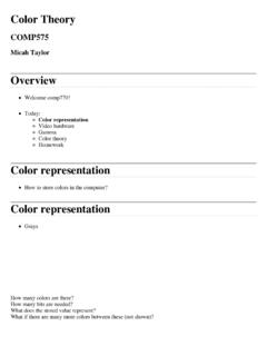
Transcription of presents THE COLOR WHEEL AND BEYOND - Color Theory, …
1 PresentsTHE COLOR WHEEL AND BEYONDC olor theory , Mixing Colors, and How to Create Complementary COLOR Schemes2 COLOR WHEEL AND BEYONDThis content has been abridged from an original article written by Naomi Ekperigin. F+W Media, Inc. All rights reserved. F+W Media grants permission for any or all pages in this premium to be copied for personal Introduction to COLOR theory In the early 20th century, Johannes Itten s theories on COLOR changed the way artists and scientists viewed the spectrum of colors in the world around them. Here, we outline some of Itten s basic tenets many of which are still employed by artists today. by Naomi EkperiginItten s original COLOR COLOR WHEEL AND BEYONDS wiss painter and teacher Johannes Itten was a pivotal member of the Bauhaus, Germany s most influential art and design school.
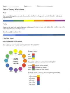
2 Founded in 1919 and closed in 1933 under the threat of the Fascist party, the Bauhaus School primarily focused on expressionist art, design, and architecture. From 1919 to 1923, Itten was the main painter at the institution and taught a required intro-ductory course that focused on form and COLOR . The theories developed and taught in this class are still practiced by artists today and are very useful for beginning artists as they learn to create rich, realistic, and dynamic s COLOR WHEEL was a departure from the COLOR wheels employed at his time. Many contained too few or too many colors, making it either difficult to find the connections between hues, or too complicated and rigid to facilitate instruction. Itten s WHEEL contained twelve colors: the three primary colors, the three secondary, and the six tertiary colors.
3 Primary Colors are the building blocks for all other hues, and cannot be created by mixing any other pigments. They are blue, yellow, and Colors are each created from two of the primaries. They are orange, green, and violet. Like the pri-mary colors, they are equidistant from one another on the COLOR Colors are formed by mix-ing a primary and secondary COLOR . They are yellow-green, yellow-orange, Newborn Child by Georges de La Tour, ca. 1645, oil on canvas. Collection Mus e des Beaux-Arts, Rennes, COLOR WHEEL AND BEYONDred-orange, red-violet, blue-violet, and blue-green. The artist s most notable impact on present-day COLOR theory was the asso-ciation of certain colors with specific emotions. His book The Art of COLOR was a synopsis of his teachings at the Bauhaus, and was groundbreaking in its study of colors impact on the viewer.
4 Like other artists and theorists before him, Itten studied colors scien-tifically as well as artistically. What set him apart from his contemporaries was the use of psychoanalysis to inform his theories. He looked at the way colors impacted a person, as well as individu-als perceptions of COLOR . To the artist-educator, there were four qualities of a COLOR : hue, inten-sity, value, and temperature. Hue is generally defined as a source COLOR , one of the twelve basic colors on the COLOR WHEEL . Knowing the root hue allows one to mix the COLOR that he or she sees using a basic palette. Value is the light-ness or darkness of the COLOR relative to white, black, and gray. Intensity is the brightness or dullness of a COLOR , often determined by the amount of white or complement has been mixed with it.
5 It is measured relative to the brightest COLOR WHEEL hue that is closest to the COLOR . Often the words chroma and saturation are used interchangeably with intensity. Temperature, to Itten, was the idea of a COLOR being warm or cool terminology still used by was also one of the first to develop successful methods of creat-ing striking COLOR contrasts. His seven methods were the contrast of satura-tion, contrast of light and dark, contrast of extension, complementary contrast, simultaneous contrast, contrast of hue, and the contrast of warm and relates to the degree of purity of a COLOR . The contrast of saturation is the juxtaposition of pure, intense colors and dull colors. This Cafe Terrace at Night by Vincent van Gogh, 1888, oil, 32 x 26. Collection Rijksmuseum Kroller-Mueller, COLOR WHEEL AND BEYONDV irgin of the Chancellor Rolin by Jan van Eyck, 1435, oil on wood, 26 x 24.
6 Collection the Mus e du Louvre, COLOR WHEEL AND BEYONDcan be seen in Georges de La Tour s Newborn Child as the women s bright clothes, illuminated by candlelight, offer a sharp contrast to the dull back-ground of light and dark is created when, as the name suggests, light and dark values of a COLOR are juxtaposed. The most obvious examples of this are pen-and-ink and graphite drawings as well as etchings and prints. You can see this at work in James McNeill Whistler s Reading by Lamplight. The contrast of extension, also known as a contrast of proportion, is based on the relative areas of two or more areas of COLOR , such as large and small, or much and little. In Pieter Brueghel s Landscape With the Fall of Icarus, this contrast is at work in the juxtaposition of a large body of blue water and a small patch of sky.
7 A complementary contrast exists when two complementary colors (col-ors that are opposite each other on the COLOR WHEEL ) are placed side-by-side. Jan van Eyck s Virgin of the Chancellor Rolin, the red and green motif (in the robe, lectern, and angel s wing) is Itten s pri-mary example of this contrast. Simultaneous contrast occurs when opposing colors are placed next to each other, creating the illusion of vibrations or shadows. In Vincent van Gogh s Caf Terrace at Night, the use of dark blue for the figures on the terrace makes them appear to be shadows, pri-marily because of the contrast between the light orange-yellow and dark blue. A contrast of hue is the easiest to identify, as is created by the juxtaposi-tion of different hues. Itten reasons that the intensity of the contrast dimin-ishes as the hues move farther away from the primary colors.
8 The most extreme example of this contrast is red/yellow/blue, and can be seen in Alessandro Boticelli s Lamentation Over the Dead Christ With the Saints Jerome, Paul, and by Lamplight by James McNeill Whistler, 1858, etching and drypoint printed in black ink on ivory laid paper, 6 13 16 x 4 9 16. Collection The New York Public Library, New York, New COLOR WHEEL AND BEYONDThe contrast of warm and cool is created when colors that are considered warm or cool (as defined by Itten) are juxtaposed. Warm colors such as red, orange, yellow, and browns evoke a feeling of warmth and comfort, and are attractive to the viewer. As a result, objects painted this COLOR appear to move forward. Cool colors, such as blue, green, and grays, recede into the background. Psychologically, Itten found that they were associated with sadness and melancholy.
9 Many of the great Impressionist painters employed this contrast in their landscapes. In Camille Pissarro s work, red/brown/orange in architectural features like houses and churches are often jux-taposed with cool skies, establishing depth and perspective for the viewer. When viewing works of art, most viewers see these contrasts at work, but do not know how to identify them. For an artist, knowledge of the basic tenets of COLOR theory can help him or her evoke emotion and leave an impact on the viewer. And just as Itten s methods can be adopted to yield certain effects, they can also be subverted to shock the viewer and show subject matter in star-tling ways. nLEFTL andscape with the Fall of Icaruscopy of original by Pieter Brueghel, ca. 1558, oil on wood, 29 x 44. Collection the Musees Royaux des Beaux-Arts de Belgique, Over the Dead Christ With the Saints Jerome, Paul, and Peter by Alessandro Botticelli, ca.
10 1495, tempera on panel, 42 x 28. Collection the Museo Poldi Pezzoli, COLOR WHEEL AND BEYONDThis content has been abridged from an original article written by Naomi Ekperigin. F+W Media, Inc. All rights reserved. F+W Media grants permission for any or all pages in this premium to be copied for personal with a Complementary Pa letteWorking with a complementary palette can lead to harmonious paintings and the creation of clear, vibrant colors. by Naomi EkperiginStill Life of Egg and Glass by Jacob Stevens, 2007, oil on board, 24 x 18. Private COLOR WHEEL AND BEYONDFor many artists, choosing a palette can be difficult. Each poses different sets of benefits and challenges, and it can take time to learn to maximize a palette s effectiveness. A palette can be made with as few as three colors, and traditional painting is taught with the rule that the primary colors red, yellow, and blue can be used to make all other hues.