Transcription of COLOR THEORY - Adesina Media
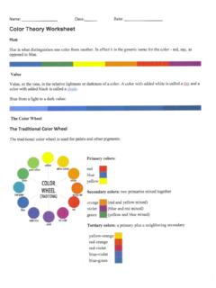
1 COLOR THEORY . For Non-Designers WHAT IS COLOR THEORY . Colors can be used in specific combinations to strengthen a visual work History dating back to the 1400s Interdisciplinary usages amongst designers of all kinds Various COLOR systems, to include RYB system WHY SHOULD I CARE? Keep user attention Take advantage of specific meanings that COLOR can evoke Influence your viewers'. first-impression TODAY'S AGENDA. The COLOR Wheel COLOR Schemes Choosing COLOR Practice Exercises THE COLOR WHEEL. COLOR WHEEL SHADES. Red Red-Orange Red-Violet Orange Violet Orange-Yellow Blue-Violet Yellow Blue Yellow-Green Blue-Green Green Primary (Red, Yellow and Blue). Colors cannot be created by combining other colors. Secondary (Orange, Green and Purple). Colors are created by combining primary colors.
2 Tertiary (Red-violet, red-orange, yellow-orange, yellow-green, blue-green and blue-violet). These are shades that are created by mixing a primary and secondary shade on the COLOR wheel. Complementary Colors exactly opposite from each other on the COLOR wheel. Split Complementary This combination is created by first picking a COLOR and then finding the two colors touching the first COLOR 's complements. Tertiary Triad A combination of equidistant tertiary shades that form a triangle on the COLOR wheel. Analogous Any set of colors that are adjacent to each other on the COLOR wheel. Clash This combination is created by first picking a COLOR and then finding one colors touching the first COLOR 's complement. Monochromatic A single COLOR and any tints or shades associated with that COLOR .
3 Achromatic A COLOR scheme that is absent of COLOR , only using shades of black, white and gray. Neutral A COLOR palette that is created by adding a little bit of a COLOR 's complement to itself, often resulting in light, pale shades. COLOR SCHEMES. TEMPERATURE. Hot Intense and attention-grabbing, these schemes often include bright shades of red Warm Red is tempered by the shade yellow to create an inviting feel that is less aggressive. Cold Can be powerful, frigid or austere, these palettes include bright shades of blue. Cool Yellow and red are blended with blue to create calming, meditative and peaceful palettes. INTENSITY. Light Very little COLOR is mixed into these shades, making them almost white. Light colors evoke the feelings of airiness and openness. Pale Pale colors are also mixed with a large amount of white, and because of their cooler feel, are considered romantic and gentle.
4 Bright Vivid colors that are pure and seem to jump off the page. Use bright colors to add energy to your work. Dark Strong and sober colors that fill up space. Dark colors are good for creating contrast against lighter colors, and can give off the feelings of tradition and dignity. CHOOSING COLORS. COLOR MOODS. Powerful Moving Calm Rich Elegant Regal Romantic Fresh Magical Vital Traditional Energetic Earthy Refreshing Subdued Friendly Tropical Professional Soft Classic Welcoming Dependable CHOOSING COLOR . FOR A PROJECT. What is the mood? Are there colors that must be used? Are there colors that should be excluded? CHOOSING COLOR . IN 4 STEPS. Define the goal of your project Choose a COLOR that fits that mood Use the COLOR wheel to make a palette Edit and scale dow