Transcription of Data Visualization
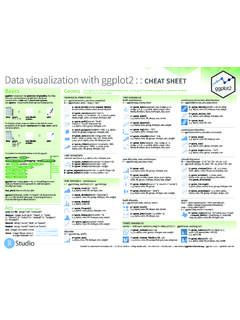
1 data VisualizationCreated By:Joshua Rafael 1 Basic Visuals | Matplotlib, SeabornBasic Visualization Concepts, Introduction and Comparison b/t Matplotlib and Seaborn Python Libraries in Jupyter 2 Interactive Visuals | Plotly, Bokeh, Tableau, insights into more interactive and fun data Visualization functions. Introduction to Plotly, Bokeh and made by Freepik from Notebooks Slideshow Homework ReferencesTable of Contents(Note: Click on hyperlinks to go to different parts of the slides.) About Matplotlib Installing Matplotlib Object Hierarchy Functional/MATLAB Approach (w/ ex) Object-Oriented Approach (w/ ex)0. About/Intro1. Matplotlib About Seaborn Installing Seaborn Theme Adjustments (w/ ex)2. Seaborn About Plotly Installing Plotly Using Plotly Offline or Online Plotly Examples Plotly Alternatives: Bokeh (w/ ex) Plotly Links to Notebooks References Cited5. References4. Tableau About Tableau Tableau Desktop No-Code Visualization Tools Visualization ComparisonData VisualizationWhat is data Visualization ?
2 data Visualization is the graphical representation of information and are the advantages of data Visualization ?Makes for easier interpretation of patterns and trends as opposed to looking at data in a tabular/spreadsheet makes for effective data Visualization ? Visualization transforms data into images effectively and accurately represent information about the : Applied data VenturesSutardja Center at UC BerkeleyExamples of data VisualizationsLeft to Right: John Snow s 1854 Cholera Outbreak Map, Demographic Gender Breakdown, Government Budget Treemap of BeninPainting a Picture of data Visualization : Oxford English Dictionary Definition, 1989: To form a mental image, picture of (something not present or visible to the sight, or of an abstraction); to make visible to the mind or imagination There are 3 goals: To explore data , to analyze data , and/or to present data VisualizationQuestion: What Would You Like to Show?
3 Relationships between variables Composition of the data over time Distribution of variable(s) in data Comparison of data with relation to time, variables, categories, data Matplotlib: Matplotlib is a comprehensive library for creating static, animated and interactive visualizations in Python. Usage: Matplotlib/Pandas is mostly used for quick plotting of Pandas DataFrames and time series - AboutPros and Cons of Matplotlib: Pro: Easy to setup and use. Pro: Very customizable. Con: Visual presentation tends to be simple compared to other - InstallationInstalling Matplotlib should be straightforward. Sample code for installing packages:MatplotlibSeabornPlotlyTableauR esourcesMatplotlibSeabornPlotlyTableauRe sourcesMatplotlib - Object Hierarchy Figure: Outermost container for a Matplotlib graphic. Can contain multiple Axes objects. Axes: Actual plots. Contain smaller objects (tick marks, individual lines, etc.)
4 Artist: Everything that is seen on the figure is an Approach (Non-Pythonic) Most common way of Matplotlib. Pro: Easy approach for interactive use. Con- Not pythonic: Relies on global functions (where variables are declared outside of functions) and displays global - 2 Approaches to Plotting Approach (Pythonic) Recommended way to use Matplotlib. Pro: Pythonic is object-oriented (you can build plots explicitly using methods of the figure and the classes it - Non-Pythonic ExampleExample: Combining Line & Scatter Plots From Categorical VariablesMatplotlibSeabornPlotlyResource sMatplotlibSeabornPlotlyTableauResources Matplotlib - Pythonic ExampleExample: Simple Line Plot & Bar Seaborn: Seaborn is a Python data Visualization library based on Matplotlib. It provides a high-level interface for drawing attractive and informative statistical graphics. Usage: Those who want to create amplified data visuals, especially in - AboutSeaborn s Pros and Cons: Pro: Includes higher level interfaces and settings than does Matplotlib Pro: Relatively simple to use, just like Matplotlib.)
5 Pro: Easier to use when working with Dataframes. Con: Like Matplotlib, data Visualization seems to be simpler than other - InstallationInstalling Seaborn should also be straightforward. Sample code:MatplotlibSeabornPlotlyTableauResou rcesTheme Design- Setting Style: Use the five built-in themes to style the figure/background of plots: Grids: darkgrid, whitegrid Colors: dark, white, - Theme AdjustmentsSetting Scale: Use the four scaling plot presets to customize the size of the plot: In order of relative size: paper, notebook, talk, Fonts and Line Widths: How to change the size of the text: Change the font_scale parameter for (). How to change the line width of the text: Change the rc parameter for ().MatplotlibSeabornPlotlyTableauResourc esSeaborn - Theme Adjustments w/ ExamplesLet s look at the 5 built-in themes to style the figure (background of plots): Grids: darkgrid, whitegrid Colors: dark, white, and examples using famous Iris Flower data Set.
6 Features of graphs: Left graph uses vertical bar plot w/ whitegrid, right graph uses swarm plot with 1- Default & Built-In Color Palettes: About: Seaborn has six variations of its default color palette: deep, muted, pastel, bright, dark and colorblind. How to use: Use () or () for individual plots. To set a color palette for all plots, use (*args).Seaborn - Theme Adjustments: ColorMatplotlibSeabornPlotlyTableauResou rcesSeaborn - Theme Adjustments: ColorOption 2- Color Brewer Palettes: About: Created from the research of cartographer Cindy Brewer, these color palettes are specifically chosen as to be easy to interpret ordered categories. How to use: Use () or () for individual plots. To set a color palette for all plots, use (*args).MatplotlibSeabornPlotlyTableauRe sourcesSeaborn - Theme Adjustments: Color ExamplesLeft image: Code and resulting plot using default & built-in color image: Code and resulting plot using a Color Brewer vs.
7 Seaborn Visuals Options Plotly: From website: Plotly is an interactive, open-source plotting library that supports over 40 unique chart types. Usage: Plotly is advantageous for those who want an interactive environment which many use cases, ranging from statistics to finance to geography and - AboutPros and Cons of Plotly: Pro: Make beautiful, interactive, exportable figures in just a few lines of code. Pro: Much more interactive & visually flexible than Matplotlib or Seaborn. Con: Confusing initial setup to use Plotly without an online account, and lots of code to write. Con: Out-of-date documentation and the large range of Plotly tools (Chart Studio, Express, etc.) make it hard to keep Plotly Offline: (if you want to host locally on your own computer) Steps: You need to import packages and use commands: Resource: Keep checking current version: Initialization for Online Plotting Command to create standalone HTML: () Command to create plot in Jupyter Notebook: ()Plotly - InstallingInstalling Plotly Online: (use if you want to host graphs in plotly account) How to: You must create an account to up an account at a User ID and API keys into the : Bokeh is an interactive Visualization Python library.
8 Provides elegant and concise construction of versatile graphics. Usage: Can be used in Jupyter Notebooks and can provide high-performance interactive charts and - Alternatives (Bokeh, ) : (used with Flask) is a framework used with HTML, CSS, and Javascript together to create visualizations. Usage: Use build-in data -driven transitions for extra customization and elevated Visualization for your data . Pro: Helps build type of framework you want (Plotly uses library, here you can use the library itself; open-source) Con: High learning curve; you need to learn HTML, CSS, JavascriptMatplotlibSeabornPlotlyTableau ResourcesBokeh - ExampleExample of using Bokeh from article. Screenshots of interactive features that Bokeh offers: Are Dashboards: Dashboards act as a data Visualization tool where users can easily analyze trends and statistics. It can be a powerful way of communicating results of a data Science project.
9 Examples: Dash by Plotly, Bokeh Dashboards, Google data Studio, TableauTableau: Intro & SetupAbout Tableau (Tableau Desktop): Pros: Makes the charts and interface almost seamlessly. Con: Getting used to the interface and functions. Con: data cleaning/pre-processing easier in up: 1-year free trial of Tableau Desktop for Students. (Paid differs by individual vs organization.) Tableau Public (create separate account); share data visualizations with global community. Introductory videos are a great resource; robust and go through examples in - Tableau Desktop (for Students)Go to this link to try out a trial: - Tableau Desktop (for Students)When you download the Tableau Desktop Application (MacBook Pro):MatplotlibSeabornPlotlyTableauResou rcesInfogram: | Web-based Visualization environment; infographic environment. Multiple PDF/PNG or HTML-based templates; interactivity built-in. Paid version offers: Engagement analytics, team collaboration, consistent product : No-Code Visualization ToolsFlourish: | Another web-based Visualization environment.
10 Interest: Interface is pretty straightforward, and visualizations can be really interactive. Note: Best for spreadsheet junkies!Datawrapper: | Web-based Visualization and map creation environment. Niche service, offers some powerful capabilities. Fact: Interesting Tools ComparisonMatplotlibSeabornPlotlyTableau ResourcesData import & usageViz options & customizationFree/paid featuresMore or less technical?- Can import from many data Robust Many graph Experienced users understand Tableau Public - Tableau Desktop (1-Year free trial student)- More technical due to interface and multitude of Can import from some data Some Many infographic visual Drag & drop Free w/ account; - Make publicly available PDF, PNG or HTML- Less technical- No code; interface accessible to Import from Microsoft Excel, CSV, Some Graph, infographic and slide Straightforward editing Free w/ account;- Embed, PDF, PNG, or Less technical- No code.