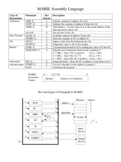
Transcription of jmp.com/learn rev 07/2012 Bar Charts and Frequency ...
1 Example: (Help > Sample Data) Bar Charts and Frequency Distributions Use to display the distribution of categorical (nominal or ordinal) variables. For the continuous (numeric) variables, see the page Histograms, Descriptive Stats and Stem and Leaf. Bar Charts and Frequency Distributions 1. From an open JMP data table, select Analyze > distribution . 2. Click on one or more nominal or ordinal variables from Select Columns, and click Y, Columns (nominal variables have red bars, and ordinal variables have green bars). 3. If you have summarized data (a column with counts), enter the column into Freq. 4. Click OK to generate bar Charts and Frequency distributions for each variable.
2 Tips: To change the display from vertical to horizontal, click on the top red triangle and select Stack. To change future output to horizontal, go to Preferences > Platforms > distribution , click Stack and Horizontal, then click OK. To change the graphical display for a variable, or to select additional options, click on the red triangle for that variable. Click on bars in one graph to see the distribution the variable across other variables (dynamic linking). Categorical variables display in alphanumeric order. To change the display order, use the Value Ordering or Row Order Levels column property (right-click on the column, select Column Info, then Column Properties).
3 Bar Charts Another Way 1. Select Graph > Graph Builder. 2. Click, then drag and drop a nominal variable from Select Columns to the X zone on the bottom of the graph. 3. Click on the bar chart icon above the graph. 4. Drag and drop a continuous weight variable from Select Columns to the Y zone on the left of the graph, or a drag and drop a count or Frequency variable to the Freq field. 5. Select a statistic to be plotted from list of Summary Statistics (bottom left). 6. When finished, click Done (top left) to close the control panel. Notes: Bar Charts can also be created in the Chart platform (Graph > Chart). For more details on creating bar Charts , see the book Basic Analysis and Graphing (under Help > Books).
4 Rev 07/2012 Example: (Help > Sample Data) Pareto Plots and Pie Charts Use to display the distribution of categorical (nominal or ordinal) variables. Pareto plots sort in descending order of Frequency of occurrence or weight (value). Pareto Plots 1. Select Analyze > Quality and Process > Pareto Plot. 2. Click on a nominal variable from Select Columns, and click Y, Cause (nominal variables have red bars, ordinal variables have green bars). 3. If you have summarized data, enter the Count column into Freq. 4. Click OK to generate the Pareto plot . Tips: To change the display or select additional options, click on the red triangle.
5 To change the display from a Pareto plot to a pie chart, click on the red triangle and select Pie Chart. To label a bar or slice of the pie, right-click on the category and select Causes > Label. Pie Charts Another Way 1. Select Graph > Chart. 2. Click on a nominal variable from Select Columns, and click Categories, X, Levels. 3. If you have summarized data, click on the blue triangle next to Additional Roles, and enter the Count column into Freq. 4. Under Options, click on the small black triangle next to Bar Chart and select Pie Chart. 5. Click OK to generate the pie chart. 6. To change the display from a pie chart to a bar chart, click on the red triangle and select Pie Chart.
6 Notes: Bar Charts can also be produced from Analyze > distribution or Graph > Graph Builder. For more details on creating pie Charts and Pareto plots, see the books Basic Analysis and Graphing and Quality and Reliability Methods (under Help > Books). rev 07/2012 Example: Car (Help > Sample Data) Mosaic Plot and Contingency Table Use to examine the relationship between two categorical variables. A contingency table shows the Frequency distribution of the variables in a matrix format, while a mosaic plot graphically displays the information. The Contingency Table Analysis 1. Select Analyze > Fit Y by X. 2. Click on a categorical variable from Select Columns, and click Y, Response (categorical variables have red or green bars).
7 3. Click on another categorical variable and click X, Factor. 4. Click OK. The Contingency Analysis output will display. Mosaic Plot The mosaic plot is a side-by-side divided bar chart that allows you to visually compare proportions of levels of one variable across the levels of a second variable. Contingency Table The body of the contingency table displays: Count the cell frequencies (counts). Total % - the cell s percentage of the total count. Col % - the cell s percentage of the count for the column. The column variable is the Y variable, type. Row % - the cell s percentage of the count for the row. The row variable is the X variable, marital status.
8 The borders of the contingency table display the column totals (across the bottom), row totals (on the right), and the grand total (lower right corner). Tips: Click on the red triangle next to Contingency Table to select or deselect display options. Right-click on the mosaic plot to change colors (Set Colors) or label cells (Cell Labeling). Note: See the Basic Analysis and Graphing book (under Help > Books) for more details. Interpretation: widths of horizontal bars represent the proportions of the levels of the X variable (in this example, marital status). heights of vertical bars on the far right represent the proportions of the levels of the Y variable (type).
9 Cells in the plot represent the proportions for every combination of category levels. In this example, Married and Family is the largest overall proportion. X = Married Y = Family Legend rev 07/2012 Example: Car Physical (Help > Sample Data) Histograms, Descriptive Statistics, and Stem and Leaf Use to display and describe the distribution of continuous (numeric) variables. Histograms and stem and leaf plots allow you to quickly assess the shape, centering and spread of a distribution . For categorical (nominal or ordinal) variables, see the page Bar Charts and Frequency Distributions. Histograms and Descriptive Statistics 1.
10 From an open JMP data table, select Analyze > distribution . 2. Click on one or more continuous variables from Select Columns, and click Y, Columns (continuous variables have blue triangles). 3. Click OK to generate a histogram, outlier box plot and descriptive statistics. The percentiles, including quartiles and the median, are listed under Quantiles. The sample mean, standard deviation and other statistics are listed under Summary Statistics. Tips: To change the display from vertical to horizontal (as shown), click on the top red triangle and select Stack. To change the graphical display for a variable, or to select additional options, click on the red triangle for that variable.


![Describing and Comparing Data Distributions [Teacher Version]](/cache/preview/4/8/8/1/a/a/7/d/thumb-4881aa7da51f684046f4244443a3c04f.jpg)