Transcription of Describing and Comparing Data Distributions [Teacher Version]
1 Describing AND Comparing DATA D I S T R I B U T I O N STEACHER VERSIONS ubject Level:High School MathGrade Level:9 Approx. Time Required:50 minutesLearning Objectives: Students will be able to compare and contrast data Distributions in terms of shape, center, and spread. Students will be able to describe key features of a histogram or box MATH | PAGE 1 Describing AND Comparing DATA Distributions TEACHER VERSIONA ctivity DescriptionStudents will use data on the organization, spending, and populations of governments at different levels (city or town, county, and state) to compare and contrast the Distributions of these variables in graphs, analyzing the shape, center, and spread of Grade Level:9 Approximate Time Required:50 minutesLearning Objectives: Students will be able to compare and contrast data Distributions in terms of shape, center, and spread. Students will be able to describe key features of a histogram or box : Box plots HistogramsSkills Taught: Comparing and contrasting the shapes of data MATH | PAGE 2 Describing AND Comparing DATA Distributions TEACHER VERSIONM aterials Required The student version of this activity, 11 pages Calculators graph paperA graphing calculator or other graphing technology and a teacher computer with a projector are ItemsThe following items are part of this activity.
2 The items, their data sources, and any relevant instructions for viewing the source data online appear at the end of this teacher version. Item 1: Population, Land Area, and Other Data for the 50 States and District of Columbia Item 2: Income, Employment, and Other Demographic Data for the 50 States and District of ColumbiaFor more information to help you introduce your students to the Census Bureau, read Census Bureau 101 for Students. This information sheet can be printed and passed out to your students as AddressedSee charts below. For more information, read Overview of Education Standards and Guidelines Addressed in Statistics in Schools Activities. Common Core State Standards for statistics appropriate to the shape of the data distribution to compare center (median, mean) and spread (interquartile range, standard deviation) of two or more different data Interpreting Categorical & Quantitative DataSummarize, represent, and interpret data on a single count or measurement differences in shape, center, and spread in the context of the data sets, accounting for possible effects of extreme data points (outliers).
3 ID Interpreting Categorical & Quantitative DataSummarize, represent, and interpret data on a single count or measurement MATH | PAGE 3 Describing AND Comparing DATA Distributions TEACHER VERSIONC ommon Core State Standards for Mathematical Reason abstractly and will describe and compare Distributions in terms of shape, center, and Attend to will communicate precisely when Comparing and contrasting Distributions with statistical Council of Teachers of Mathematics Principles and Standards for School MathematicsContent StandardStudents should be able to:Expectation for Grade BandData Analysis and ProbabilityFormulate questions that can be addressed with data and collect, organize, and display relevant data to answer histograms, parallel box plots, and scatterplots and use them to display Analysis and ProbabilitySelect and use appropriate statistical methods to analyze univariate measurement data, be able to display the distribution , describe its shape, and select and calculate summary for Assessment and Instruction in Statistics EducationGAISEL evel ALevel BLevel CFormulate QuestionsXCollect DataXAnalyze DataXInterpret MATH | PAGE 4 Describing AND Comparing DATA Distributions TEACHER VERSIONB loom s TaxonomyStudents will analyze histograms and box plots to describe and compare data Distributions .
4 Deciding the appropriate summary statistics to report and investigating their own MATH | PAGE 5 Describing AND Comparing DATA Distributions TEACHER VERSIONT eacher NotesBefore the ActivityStudents must understand the following key terms: frequency the number of times a value occurs in a data set Interquartile range (IQR) a measure of variability in a set of numerical data to indicate the difference between the first and third quartiles of the data set Mean a measure of center in a set of numerical data, computed by adding the values in a list and then dividing by the number of values in the list Median a measure of center in a set of numerical data, identified as the value appearing at the center of a sorted version of the list (or the mean of the two central values if the list contains an even number of values) First quartile (Q1) also known as lower quartile, the value that divides an ordered data set into the smallest 25 percent of the data and the largest 75 percent Third quartile (Q3)
5 Also known as upper quartile, the value that divides an ordered data set into the smallest 75 percent of the data and the largest 25 percent Box plot a method of visually displaying a data set using the median, quartiles, and extremes of the data set Standard deviation a measure of spread for a set of numerical data, calculated by taking the square root of the variance, that increases in value as the data in the set become more spread out Shape the general form of a data distribution ( , bell-shaped, bimodal, irregular, uniform)Students should have the following skills: Ability to calculate the mean, the median, the IQR, and the standard deviation Ability to construct a histogram Ability to describe the shape of a data distributionTeachers should divide students into groups of two to four and ask them to examine Items 1 and 2. Teachers should have each group share what they know or think about the data to make predictions about trends, prompting them with questions like: Do all states operate in a similar way?
6 Are the school district structures similar? Do you think residents in these states have similar lifestyles?Teachers could review with students the Census Bureau one-pager mentioned earlier and describe the various data the Census Bureau collects, explaining that this activity involves analysis of some of these MATH | PAGE 6 Describing AND Comparing DATA Distributions TEACHER VERSIOND uring the ActivityTeachers should remind students that when they describe the distribution of numerical data, they should always consider shape, center, and should have groups share their responses to questions 1 and 2 with the class, recording students observations and questions on the board or chart paper, or typing and projecting them on a screen. Students may return to this list to choose their topic for question question 6, teachers could ask students to guess how histograms showing the number of counties in the four regions of the United States designated by the Census Bureau (Midwest, Northeast, South, and West)
7 Might compare with one should decide whether students will use graph paper or graphing technology to create their histograms for question the ActivityTeachers could facilitate a discussion of the data chosen for question 10, asking students to share what they found interesting or surprising with their groups and then with the a review, teachers could have students summarize ways to describe a data distribution by its shape, center, and spread and ways to compare two or more Distributions by examining their key IdeaTeachers could have students create histograms or box plots according to Census Bureau region for the variable they select in question 10. Students could compare and contrast these regional Distributions , noting anything interesting or MATH | PAGE 7 Describing AND Comparing DATA Distributions TEACHER VERSIONS tudent ActivityClick here to download a printable version for ItemsThe following items are part of this activity and appear at the end of this student version.
8 Item 1: Population, Land Area, and Other Data for the 50 States and the District of Columbia Item 2: Income, Employment, and Other Demographic Data for the 50 States and the District of ColumbiaStudent Learning Objectives I will be able to compare and contrast data Distributions in terms of shape, center, and spread. I will be able to describe key features of a histogram or box entities in the United States exist in many forms and sizes. From the smallest town council to the Congress, these entities pass laws, oversee infrastructure, and provide for public education, among other things. In this activity, you will analyze state and county data and compare Distributions by examining their shape, center, and Look at Item 1: Population, Land Area, and Other Data for the 50 States and the District of Columbia and Item 2: Income, Employment, and Other Demographic Data for the 50 States and the District of What is one thing about the data that catches your attention?
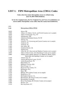
9 Student responses will vary but could include: Texas has the most counties of any state. A typical state has between 40 and 100 counties. Many states have fewer than 20 counties. A large percentage of people in the District of Columbia and Massachusetts have bachelor s degrees or What is one question you have about the data that you can investigate?Student responses will vary but could include: Does the number of counties have anything to do with the area of a state? Does the number of counties have anything to do with the population of a state? Does the number of counties have anything to do with the state s region in the country? MATH | PAGE 8 Describing AND Comparing DATA Distributions TEACHER VERSION2. Share your responses to question 1 with your group. Are they similar or different? How so?Student answers will Recall that a data distribution s shape can be described as symmetric, skewed left, skewed right, uniform, or bimodal.
10 Looking at the histogram below that shows the distribution of the number of counties in each state and the District of Columbia, how would you describe its shape?Number of Counties in Each State and the District of ColumbiaSkewed right4. Does the mean or the median better represent the center of this type of data distribution ? Why?The median, because this measure is more appropriate for data Distributions that are skewed or have an outlier. For a data distribution is skewed or has an outlier, the mean can sometimes be too high or too low to represent the center because it accounts for extreme data The range of this distribution s data set is 253, the standard deviation is , and the interquartile range (IQR) is 65. Which value best represents the spread for this type of data distribution , and why?The IQR, because it shows the length of the interval containing the middle half of the data, it relates to the median value we identified as the center, and it is not as affected as the other measures by the outlier in this data MATH | PAGE 9 Describing AND Comparing DATA Distributions TEACHER VERSION6.