Transcription of Landscape Basics: Color Theory - University of Georgia
1 Landscape basics : Color Theory Matthew Chappell1, Brad Davis2, Bodie Pennisi1 and Merritt Sullivan31 Department of Horticulture2 Department of Landscape Architecture3 Department of Horticulture, StudentThere are many things to consider when designing an exceptional Landscape . Plants play an important role in making landscapes function well for both human and natural systems. Besides function, plants make landscapes attractive. A Landscape full of colorful and interesting plant combinations generates attention and can direct people toward a focal point. As a major design principle, plants can express each of the elements of art that are defined as form, line, shape, Color , texture, space and value.
2 When combined, these artistic elements begin to express the principles of design, including emphasis, balance, harmony, variety, movement, rhythm, proportion and unity. Color is a strong design element and can be used to attract attention and guide the human eye. Because of its strength, Color can also become a problem when used incorrectly. This publication explores Color relationships in the Landscape , ways of seeing plants in terms of Color , and various ways to use Color successfully in plant selection and Landscape design and composition. However, one must remember to consider all elements of art before completing a Landscape design.
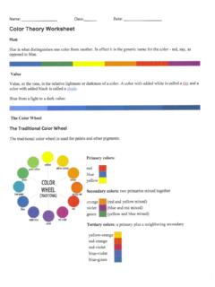
3 Primary and Secondary ColorsThere are three primary colors blue, red and yellow that can be mixed in different ways to make all other colors. Secondary colors green, orange and violet (purple) are made by mixing two primary colors. For example, when blue and yellow are mixed, they make green. When yellow and red are mixed, they make orange. When red and blue are mixed, they make purple. An easy way to visualize this is with a Color wheel (Figure 1). Color is also referred to as hue, or pure of ColorColors can be described as cool or warm. Green and blue are cool colors. They are usually associated with water, sky and forest and they evoke relaxed and calm feelings.
4 Red, orange and yellow are warm colors often associated with heat, fire and the sun. Because of this, they demand attention and evoke excitement. Purple is often confusing because it can be either a cool or warm Color depending on other colors that appear adjacent to it in a Landscape . When purple appears near blue, it is perceived as a cool Color . When near red, purple is seen as a warm Color . It may seem odd that colors can have such an effect on people, but this has long been studied by psychologists and is used in the design of many products and places. For example, fast food restaurants typically use warm colors to excite customers and get them in and out the door faster whereas hospitals typically use cool colors in rooms to create a calm and relaxing 1.
5 Color basics : Color Theory UGA Extension Bulletin 13962 Color ValueValue is the lightness or darkness of each Color . Adding white, black or white and black (which combine to make grey) to each Color changes its value (Figure 2). When white is added to a Color it becomes lighter and is called a tint. When black is added, it makes a Color darker and it is called a shade. When grey is added it is called a tone. Let s take red, for example. When white is added to red, it turns pink, a tint of red. When black or grey is added to red, it turns maroon, a shade of red. Value is important in the Landscape because the human eye is drawn to tints and shades, especially when tints, shades and tones are used close together.
6 This creates a rich visual combination that is more complex and interesting than simply one Color used repeatedly without any variation (Figure 3). Color IntensityIntensity refers to a Color s brightness. This is important to consider in the Landscape because other surroundings (or context) affect a person s perception of Color . When several bright or intense colors are used together, they increase the intensity of one another (Figure 4). In contrast, when shades or tints are used together, the overall effect is softened and less intense. Colors used with white appear brighter than the same colors used with black or very dark greens.
7 In the case where a planting is located next to a white or dark-colored building, the background will affect the perception of plant colors (Figures 4 and 5). Color Schemes Natural landscapes can provide inspiration for good Color combinations. Most people describe colors using Landscape terms, such as sky blue, grass or sage green, or fire red. Looking at natural landscapes and all of the subtle Color combinations that nature produces can be great inspiration for designing gardens. A sunset might inspire a warm Color scheme, or a walk through a forest might inspire a cool scheme using different shades of green, from grey-green to blue-green to 2.
8 Color 3. A container planting with various shades and tints of 4. Pink, orange, red, yellow and white flowers against a brick building 5. Pink, purple and white petunias against a darker brick building basics : Color Theory UGA Extension Bulletin 13963By planning what colors to plant, the Landscape architect or landscaper creates a theme for the design, or a Color scheme. There are at least six different Color schemes to choose from and they mostly refer to positions on the Color wheel. Each evokes a different psychological response. Monochromatic Color schemes use one Color and its various values (tints and shades).
9 Such schemes have harmonious visual effect (Figure 6).Analogous Color schemes use colors that are next to each other on the Color wheel. For example, orange and red are analogous; from a distance, a planting of orange and red may appear as a planting of the same Color . This is because of the closeness of the colors on the wheel. However, up close analogous colors create a rich mix of colors that blend well and are visually harmonious. Depending on the Color , a warm or cool effect can be achieved (Figures 7 and 8).Complementary Color schemes use colors that are opposite each other on the Color wheel.
10 Each complementary Color adds to the intensity of its opposite. For example, on the Color wheel purple and yellow are opposite each other. Both colors complement each other and make the brightness of the other increase. Purple and yellow is a popular combination because the colors accent one another and make each other stand out (Figure 9). In a Landscape , complementary colors are often most successful when one Color is more dominant than the other, rather than in equal proportions (in Figure 9, the yellow pansies dominate).Figure 6. A monochromatic Color scheme using green as a base Color . Whites and various shades of green create a subtle and soothing garden 7.