Transcription of Representation of Data - NCERT
1 You must have seen graphs, diagrams and maps showing different types of example, the thematic maps shown in Chapter 1 of book for Class XI entitledPractical Work in Geography, Part-I ( NCERT , 2006) depict relief and slope, climaticconditions, distribution of rocks and minerals, soils, population, industries,general land use and cropping pattern in the Nagpur district, Maharashtra. Thesemaps have been drawn using large volume of related data collected, compiledand processed. Have you ever thought what would have happened if the sameinformation would have been either in tabular form or in a descriptive transcript?Perhaps, it would not have been possible from such a medium of communicationto draw visual impressions which we get through these maps.
2 Besides, it wouldalso have been a time consuming task to draw inferences about whatever isbeing presented in non graphical form. Hence, the graphs, diagrams and mapsenhance our capabilities to make meaningful comparisons between thephenomena represented, save our time and present a simplified view of thecharacteristics represented. In the present chapter, we will discuss methods ofconstructing different types of graphs, diagrams and of DataRepresentation of DataRepresentation of DataRepresentation of DataRepresentation of DataThe data describe the properties of the phenomena they represent. They arecollected from a variety of sources (Chapter 1). The geographers, economists,resource scientists and the decision makers use a lot of data these days.
3 Besidesthe tabular form, the data may also be presented in some graphic or diagrammaticform. The transformation of data through visual methods like graphs, diagrams,maps and charts is called Representation of data. Such a form of the presentationof data makes it easy to understand the patterns of population growth,distribution and the density, sex ratio, age sex composition, occupationalstructure, etc. within a geographical territory. There is a Chinese proverb that apicture is equivalent to thousands of words . Hence, the graphic method of therepresentation of data enhances our understanding, and makes the comparisonseasy. Besides, such methods create an imprint on mind for a longer Rules for Draeneral Rules for Draeneral Rules for Draeneral Rules for Draeneral Rules for Drawing Gwing Gwing Gwing Gwing Graphs, Diagrams and Mraphs, Diagrams and Mraphs, Diagrams and Mraphs, Diagrams and Mraphs, Diagrams and Mapsapsapsapsaps1.
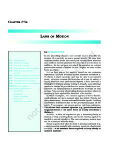
4 Selection of a Suitable MethodData represent various themes such as temperature, rainfall, growth anddistribution of the population, production, distribution and trade of differentcommodities, etc. These characteristics of the data need to be suitably representedby an appropriate graphical method. For example, data related to the temperatureor growth of population between different periods in time and for differentcountries/states may best be represented using line graphs. Similarly, bardiagrams are suited best for showing rainfall or the production of population distribution, both human and livestock, or the distribution ofthe crop producing areas may suitably be represented on dot maps and thepopulation density using choropleth Selection of Suitable ScaleThe scale is used as measure of the data for Representation over diagrams andmaps.
5 Hence, the selection of suitable scale for the given data sets should becarefully made and must take into consideration entire data that is to berepresented. The scale should neither be too large nor too DesignWe know that the design is an important cartographic task (Refer Essentials ofMap Making as discussed in Chapter 1 of the Practical Work in Geography,Part-I ( NCERT , 2006), a textbook of Class XI). The following components of thecartographic designs are important. Hence, these should be carefully shown onthe final title of the diagram/map indicates the name of the area, reference year of thedata used and the caption of the diagram. These components are representedusing letters and numbers of different font sizes and thickness.
6 Besides, theirplacing also matters. Normally, title, subtitle and the corresponding year areshown in the centre at the top of the legend or index is an important component of any diagram/map. It explainsthe colours, shades, symbols and signs used in the map and diagram. It shouldalso be carefully drawn and must correspond to the contents of the , it also needs to be properly positioned. Normally, a legend is showneither at the lower left or lower right side of the map maps, being a Representation of the part of the earth s surface, need be orientedto the directions. Hence, the direction symbol, i. e. North, should also be drawnand properly placed on the final of DiagramsConstruction of DiagramsConstruction of DiagramsConstruction of DiagramsConstruction of DiagramsThe data possess measurable characteristics such as length, width and diagrams and the maps that are drawn to represent these data relatedcharacteristics may be grouped into the following types.
7 33 Graphical Representation of DataGraphical Representation of DataGraphical Representation of DataGraphical Representation of DataGraphical Representation of Data3434343434 PPPPP ractical Wractical Wractical Wractical Wractical Work in Geographyork in Geographyork in Geographyork in Geographyork in Geography, P, P, P, P, Part-IIart-IIart-IIart-IIart-II(i) One-dimensional diagrams such as line graph, poly graph, bar diagram,histogram, age, sex, pyramid, etc.;(ii)Two-dimensional diagram such as pie diagram and rectangular diagram;(iii)Three-dimensional diagrams such as cube and spherical would not be possible to discuss the methods of construction of these manytypes of diagrams and maps primarily due to the time constraint.
8 We will,therefore, describe the most commonly drawn diagrams and maps and the waythey are constructed. These are : Line graphs Bar diagrams Pie diagram Wind rose and star diagram Flow ChartsLine GraphThe line graphs are usually drawn to represent the time series data related to thetemperature, rainfall, population growth, birth rates and the death rates. provides the data used for the construction of Fig of a Line Graph(a)Simplify the data by converting it into round numbers such as the growthrate of population as shown in Table for the years 1961 and 1981may be rounded to and respectively.(b)Draw X and Y-axis. Mark the time series variables (years/months) onthe X axis and the data quantity/value to be plotted (growth of populationin per cent or the temperature in 0C) on Y axis.
9 (c) Choose an appropriate scale and label it on Y-axis. If the data involvesa negative figure then the selected scale should also show it as shown inFig. (d)Plot the data to depict year/month-wise values according to the selectedscale on Y-axis, mark the location of the plotted values by a dot andjoin these dots by a free hand drawn : Construction of a Line Graph3535353535 Graphical Representation of DataGraphical Representation of DataGraphical Representation of DataGraphical Representation of DataGraphical Representation of DataExample : Construct a line graph to represent the data as given in Table :YearGrowth ratein : Growth rate of Population in India - 1901 to 2001*Fig.
10 : Annual Growth of Population in India 1901-2001 AAAAA ctivityctivityctivityctivityctivityFind out the reasons for sudden change in population between 1911and 1921as shown in Fig. is a line graph in which two or more than two variables are shown byan equal number of lines for an immediate comparison, such as the growth rateof different crops like rice, wheat, pulses or the birth rates, death rates and lifeexpectancy or sex ratio in different states or countries. A different line patternsuch as straight line ( ____ ), broken line (- - - ), dotted line (..) or a combinationof dotted and broken line ( ) or line of different colours may be used to indicatethe value of different variables (Fig ).*Refer to appendix for 2011 data3636363636 PPPPP ractical Wractical Wractical Wractical Wractical Work in Geographyork in Geographyork in Geographyork in Geographyork in Geography, P, P, P, P, Part-IIart-IIart-IIart-IIart-IIExample : Construct a polygraph to compare the growth of sex-ratio indifferent states as given in the Table :States/UT19611971198119912001 Delhi785801808827821 Haryana86886787086846 Uttar Pradesh907876882876898 Table : Sex-Ratio (Female per 1000 male) ofSelected Sates 1961-2001*Fig.