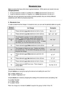
Transcription of Using Excel for Handling, Graphing, and Analyzing ...
1 Using Excel for handling , graphing , and Analyzing scientific data : A Resource for Science and Mathematics Students Scott A. Sinex Barbara A. Gage Department of Physical Sciences and Engineering Prince George s Community College Largo, MD 20774-2199 Spring 2006 version Acknowledgments The authors would like to thank Bridget Bartlebaugh of the Computer Information and Office Systems Department iii TABLE OF CONTENTS Some Excel Basics 1 Handing and Manipulating data 3 Displaying an X-Y data Set as a Scatter Plot 6 Plotting a Regression Equation 8 Interpolation and Extrapolation 10 Printing or Exporting Graphs 11 Downloading data from the Internet 11 For the More Advanced Statistical Users 12 Using Interactive Excel Spreadsheets or Excelets 14 More Resources 15 An Example of a Printed Chart 16 iv One of the authors on a bad day.
2 Just hit any key!!! Where is my graphing calculator? Using Excel scientific data 1 Using Excel for handling , graphing , and Analyzing scientific data Excel is a Microsoft computer application called a spreadsheet. It is designed to manage, manipulate, and display data . It has functions appropriate for business and scientific data sets. Excel is comparable to other spreadsheet applications such as Quattro Pro by Corel. If you are familiar with the basic layout and terminology of spreadsheets you can skip this basics section or use it for review. Some Excel Basics Start Excel and a screen similar to the one below will appear. The main body of the screen will contain columns labeled with letters (A, B, ) and rows labeled with numbers (1, 2, ). A cell is a space where numbers, formulas or text can be entered. Each cell has a designation that gives its location such as F22 (column F, row 22) or CC115 (column CC, row 115).
3 Above the main body are two white regions. The left region, the Name box, indicated which cell or region (such as a chart) is active (selected). The right region is a Formula bar. Cell contents are displayed here. If you activate a cell that has a number generated by a formula, the value will appear in the cell but the 2 Using Excel scientific Dataformula will appear in the formula bar. You enter data into a cell by placing the cursor in the cell, clicking, and typing. You will notice that what you type appears in the cell and in the formula bar. data is registered by hitting Enter or Using any cursor key to change cell location. If you need to edit the contents of a cell, click on the cell and then on the formula bar; you can then change the entry in the cell or in the formula bar. Register as before. Above the Name box and Formula bar are two rows of icons called the Formatting and Standard Toolbars.
4 Some of the icons will resemble ones you have seen in word processors and others are unique to spreadsheets. If you place the cursor on an icon and wait a few seconds, the name or function of the icon will be displayed. This tool bar can be customized with additional features you frequently use by going to View/Toolbars/Customize. Above the tool bar is the Menu bar. Each item here has a pull-down menu of operations. Note that the menu item that reads data on the menu bar (on the graphic above) changes to Chart when you have a chart active. If you wish to format a whole column or row of cells, click on the column letter or row number and the entire column or row will be highlighted. Any change you make, such as defining the numerical display (under Format) or deleting, will apply to all of the highlighted cells. If you right-click the letter or number (or any cell) you will get an abbreviated menu of common operations.
5 Look at the sample sheet. You will notice that cell D2 contains the formula =A2^3. If you copy this formula and paste it into D3, Excel will use the value in cell A3 rather than A2 for the calculation. If you paste into cell D4 it will use A4. This is great if you want to extend a calculation for a whole series of data . However, if you want to lock in the cell value A2 to be used in all calculations, designate like so: $A$2. Using the dollar signs will ensure that this cell value will not change. If you want to designate a series of data values for a calculation such as an average you can use a shortcut. To designate the values in cells A2 through A6 use A2:A6. If you want A2 through B6 enter A2:B6. If you wish to insert or delete a column or row of cells, you can do this through the menu bar or by right-clicking on the column letter or row number. Excel inserts Using Excel scientific data 3columns and rows before or above the highlighted cell.
6 Highlight the column or row where the insert will occur. Go to Insert on the Menu bar and you will see column or row displayed as an option. Select that and the insertion will occur. To delete a row or column, highlight it and go to Edit and select delete. If you use the right-click option, insert and delete will appear on the menu. The tabs at the bottom of the screen (Sheet ), allow for multiple worksheets to be used in a file. handling and Manipulating data Bring up Excel on the computer and a screen like the one below will appear. This is called a worksheet in Excel and since it is active, the word data appears as a pull-down menu. Many of the toolbar icons are similar to ones used in word processing programs. Some of the ones more useful in science and math are labeled below. The first task is to enter your data into the columns. For ease of graphing , try to place your independent variable in the first column.
7 You may want to label the first cell in each column (A1, B1, C1, etc.) with the variable names. 4 Using Excel scientific DataLet s calculate the surface area and volume of cubes of varying edge length as outlined below. 1. Enter the data below into column A: Label length in Al and then start the data in A2: 1, 2, 3, .. to 10 The second task is to transform or manipulate data . 2. In B1 type Area and in B2 place the formula =6*A2^2 and then press the enter key. All calculations with a formula must start with an = in the cell. This calculates the surface area of the cube. Grab the lower right hand corner of the cell and drag down the column. This will copy the formula to the covered cells. See the screen shot given below. 3. In C1 type Volume and in C2 place the formula =A2^3 and then press the enter key. This calculates the volume of the cube.
8 Grab the lower right hand corner of the cell. When the cursor changes form to +, drag the formula down the column. Using Excel scientific data 5 The data and two calculated quantities, surface area and volume, should look like the screen shot above when you are done. If you right click on the column heading (A, B, ) you can format the cells for the number of decimal places or significant figures needed. This is very important when considering data generated by experimental measurements in science. Using the Insert Function (fx icon) or from the toolbar, which lists some common functions as shown to the right, a vast number of mathematical and statistical functions can be placed into a formula. When you select a function, a brief explanation with syntax is given in the lower part of this screen as seen below on the Insert Function pop-up screen below.
9 Further explanation of the function is available by clicking on the Help on this function. This screen shows the common logarithm function under Math. Select the function and click OK. This will bring up another pop-up window with instructions to follow. Or you can type the function name in the formula bar directly. Remember to follow the syntax. Square root, raise to a power, average, and standard deviation are a few other examples of available operations. 6 Using Excel scientific DataDisplaying an X-Y data Set as a Scatter Plot Our third task is to graph the data . This can be done Using the Chart Wizard icon (bar graph) or by finding chart under the insert menu. 1. Highlight the columns of data to be plotted. Either click on the A and B column headings or click on the first cell and drag to select the data . The first column is always treated as the x-variable in Excel .
10 2. Click on the icon that looks like a bar graph. When the Chart Wizard window appears, select XY (scatter). The scatter plot is the only graph type in Excel that will treat the x-axis as a variable. All other graph types treat the x-axis as discrete categories such as days of the week. Under chart sub-type select the unconnected data icon, the first choice, as this plots only the data points. We rarely use the connect the dots option! Select Finish. A graph should appear on the spreadsheet. The scatter with data points connected by smooth lines, the second sub-type, is used for connecting points on some plots. Excel uses cubic splines to form a nice smooth curve. In chemistry, an absorption spectrum is a situation where it is used. The connect the dots with linear segments of the third sub-type is seldom used especially when plotting experimental data where we are looking for trends in the data .