Transcription of USING SPSS FOR DESCRIPTIVE ANALYSIS - …
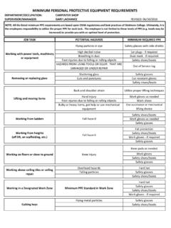
1 Description & Correlation - 1 USING spss FOR DESCRIPTIVE ANALYSIS This handout is intended as a quick overview of how you can use spss to conduct various simple analyses. You should find spss on all college-owned PCs ( , library), as well as in TLC 206. 1. If the Mac is in Sleep mode, press some key on the keyboard to wake it up. If the Mac is actually turned off, turn it on by pressing the button on the back of the iMac. You ll then see the login window. With the latest changes in the Macs, you should be able to log onto the computer USING your usual ID and Password. Double-click on the spss icon (alias), which appears at the bottom of the screen (on the Dock) and looks something like this: . You may also open spss by clicking on an existing spss data file.
2 2. You ll first see an opening screen with the program s name in a window. Then you ll see an input window (below middle) behind a smaller window with a number of choices (below left). If you re dealing with an existing data source, you can locate it through the default choice. The other typical option is to enter data for a new file (Type in data). 3. Assuming that you re going to enter a new data set, you will now see a data window such as the one seen above middle. This is the typical spreadsheet format and is initially in Data View. Note that each row contains the data from one subject. You should know the nature of your data set ( , number and nature of your variables), which is easier to set up in Variable View, so click on that button at the bottom to change the view into a window like that above right.
3 Note that the columns in Data View are now rows. You re limited to eight characters for each variable name, so try to make them as DESCRIPTIVE as possible. As you may notice, you can also attach a label to each variable. Doing so is particularly helpful for larger data sets that you may generate in real research. For now, I ll simply enter some possible variables that you might encounter in a study, just to show you how you might set up a data file. Description & Correlation - 2 Note that I set up gender as a string variable (nominal variable), so the data can be alphanumeric (letters and numbers). In this case, I ve used m and f for male and female. For integer data, you could set the number of decimals to 0, but you d actually be better off if you didn t do so.
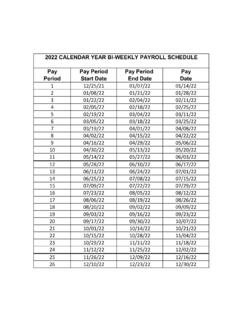
4 For real numbers, you can set the number of decimal places to whatever makes sense, or leave the default setting of 2 decimal places. Note, also, that I ve labeled some of the variables and for one variable (group), I ve set up value labels (1 = control, 2 = drug x, 3 = drug y). Labeling the values will make your output more comprehensible. Of course, you can return to the Variable View window to modify your variables, add new variables, etc. For now, though, let s return to the Data View and enter the actual data, as seen below left. Above right is a far simpler data set. In fact, these data illustrate a portion of the data from Ray (10th ed.), Table , p. 118. Even though the data are integers, it s best to input the data as real numbers with one decimal place (containing zero), because some output is determined by the number of decimal places.
5 4. To compute basic statistical information, simply click and drag down Analyze menu to reveal DESCRIPTIVE Statistics as seen below left. For the Dream data set, I might choose Frequencies, which would first produce a window (below middle) in which you choose the variable you want to analyze. (In this case there is only the one variable dreams.) As you can see (below right), the output from Frequencies is helpful to see a frequency distribution of your data. As you ll note in the middle window above, you also have three options for output ( , , and ). Description & Correlation - 3 If you chose , you d see the choices below left. (Note that I ve chosen to output some measures of variability, or dispersion, and central tendency.) If you chose , you d see the choices below middle.
6 If you chose , you d see the choices below right. Visual displays are quite helpful, so even though spss doesn t produce pretty graphs, you can see the difference between a bar chart (below left) and a histogram (below middle). The bar chart looks quite similar to the bar graph illustrated in Fig. on p. 119. The statistical choices would appear in the output as seen below on the right. Now, let s consider the original (more complex) data file. Another approach is to choose DESCRIPTIVE Statistics-> As you can see below, I ve moved all the variables to the right, so that they might be included in the ANALYSIS . spss knows that it can t compute these DESCRIPTIVE statistics on the nominal variable (gender), but it gives results for the other variables.
7 5. To print out your output, choose Print from the File menu. When you are through with spss , choose Quit from the spss menu (or close the data file). Description & Correlation - 4 Correlation Preliminaries and caveats This handout is not intended to be comprehensive in its coverage of correlation. Instead it should serve as a brief review of concepts in correlation while giving you details about how to conduct analyses and interpret output from the spss program (with some StatView as well). First of all, you should read pages 131-137 in Ray s textbook (10th ed.). Pay particular attention to the scatterplots shown in Figure that illustrate various types of relationships. It would probably also be useful to review the chapter on correlation in your old statistics textbook.
8 Overview of correlation On some occasions we are interested in determining the extent to which there is a relationship between two variables. That is, we are interested in seeing if the two variables go together or if knowing information about one variable helps us to predict scores on the second variable. The statistic used to assess the degree of relationship is the Pearson product-moment correlation coefficient (r), which can take on values from -1 to +1. Negative values of r indicate that higher scores on one variable are associated with lower scores on the other variable (see Figure 1). Positive values of r indicate that higher scores on one variable are associated with higher scores on the other variable and lower scores on one variable are associated with lower scores on the other variable (see Figure 2).
9 Figure 1 Figure 2 A correlation coefficient that is not significant (more on that later) means that you have no indication that there is a linear relationship between your two variables. Typically a non-Description & Correlation - 5 significant relationship will appear in a scattergram as a cloud of points with no apparent linear trend and a value of r that is near 0 (see Figure 3). A non-significant relationship means that knowing a person s IQ is of no benefit in predicting that person s GPA your best guess about the person s GPA is the mean GPA. Note that the correlation coefficient is only useful for assessing linear relationships. So a very strong curvilinear relationship (see Figure 4) between two variables might produce a very weak correlation coefficient (an r value near zero), even though there is a strong relationship between the two variables.
10 That s why it is so very important to look at a graph of your data. Figure 3 Figure 4 Typically one examines a relationship post hoc (after the fact) because a research design that lends itself to correlational ANALYSIS is not experimental ( , nothing is manipulated). For instance, you might wonder if there is a relationship between a person s intelligence and grade point average. To answer this question, you would simply take two measures on a group of people their intelligence ( , measured on the WAIS) and their GPA. Notice that these people s IQs and GPAs existed prior to your interest in their relationship. In fact, the relationship itself existed prior to your interest in it. All you are doing is uncovering the pre-existing relationship.