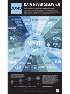
Transcription of Visualization Quick Guide - Domo
1 A best practice Guide to help youfind the right Visualization for your dataVisualization Quick GuideWHAT IS DOMO?Domo is a new form of business intelligence (BI) unlike anything before an executive management platform delivered as a service that helps managers and executives transform the way they run their key component of Domo's executive management platform is the user interface, often referred to as a dashboard, which displays a collection of key performance indicators (KPIs) as interactive visualizations. This Guide provides a Quick reference for determining which Visualization type offers the best representation of a given data more information or to contact Domo, visit can often show a number of different relationships.
2 For the development of effective dashboards, it is important to understand which relationship type is being shown, and then identify the best Visualization to express that type. Data relationship types include: Nominal Time Series Ranked Part-to-whole Frequency CorrelationThe following pages detail these relationship types, along with the most effective visualizations for each type and best practices for those visualizations. Several of the ideas and themes in this Guide build upon the works of Stephen Few; in particular, Show Me The Numbers (2004) from Analytics Press and Information Design (2006) from O Reilly Media. NOMINAL RELATIONSHIPSNOMINAL - Individual values that are comparative but not Practices Bar charts should be two dimensional with minimal distracting elements.
3 bars should be the same width and be equally spaced. It is recommended that the space between bars be larger or smaller (but not the same) as the bar width. The exception to spacing between bars is when a bar chart is used to show groups of nominal values. Use of color within bars should only be used to indicate a specific meaning that cannot be accomplished with the axis labels. Horizontal grid lines should be used to facilitate the comparison of values but should be thin and light. Vertical grid lines are generally not helpful. Horizontal ticks are typically not necessary when horizontal grid lines are used. Vertical ticks are typically not needed.
4 Since the bar chart shows relative difference, it requires a zero-based scale. Bar charts can be displayed horizontally or vertically; however, a horizontal display is most useful to show ranking or to accommodate long VisualizationNOMINAL RELATIONSHIPS (Cont d)NOMINAL - Individual values that are comparative but not a zero-point scale would make it hard to see the differences between nominal values, use a standard plot graph:When the target is the focus and an overall number is less important, there is a variation of the bar chart that can provide good visibility:TIME SERIES RELATIONSHIPSTIME SERIES - Showing values over time. Typically used to identify trends.
5 Best Practices Time should be displayed along the x-axis with equal time intervals. More than three or four lines on a chart can make it unreadable. Using selection boxes to toggle each data set on or off can provide additional data-density. Use both lines and points to provide visibility for actual values as well as the overall trend. The points should be clearly distinguishable. Use hovers to display actual values on comparing nominal values over time, and the comparison of values is more important than the trend, a bar graph can be more effective:Default VisualizationTIME SERIES RELATIONSHIPS (Cont d)TIME SERIES - Showing values over time.
6 Typically used to identify trends. Best Practices for Sparklines Start with the most basic design and add additional elements only as necessary. Indicate the time range if possible. Two sparklines can be imposed over each other when comparison is important. Since there is no legend, each line should be color coded to match another element on the dashboard. If you need a scale to make the sparkline meaningful, consider using a line chart sparkline is a mini graph used to show a preview of time series data. Described as a dataword by American statistician Edward Tufte, thesparkline does not have a scale and is often inserted as an element within a ranking is essentially a nominal comparison, the bar chart tends to be the most effective Practices A horizontal layout is generally more compelling for ranked data.
7 When using a horizontal layout, consider that the emphasis naturally appears on the object at the top, so you can choose whether to highlight the highest or lowest value, depending on your goals. Be aware that showing a small selection of data values (for example, the top five ) can make the lowest look like a poor performer and should be clearly labeled to avoid confusion. Default VisualizationRANKED RELATIONSHIPSRANKED - Organizes discrete elements in a worst-to-best (or best-to-worst) Ranked items can also be displayed as a deviation from a target, when the target is more important than reflecting the overall value:Targets can easily be shown for ranked items:RANKED RELATIONSHIPS (Cont d)RANKED - Organizes discrete elements in a worst-to-best (or best-to-worst) RELATIONSHIPSPART-TO-WHOLE - Relates individual values as measures within a total.
8 Part-to-whole data is often (but not always) expressed as a ranking is essentially a nominal comparison, the bar chart tends to be the most effective Practices Ranking part-to-whole data makes each value easier to compare. If using a percentage, be sure to mark the axis clearly to avoid confusion. VariationsA pie chart is not a best-practice Visualization , because it relies onthe eye s ability to judge area. However, when one is used, be sure to follow these best practices:Default Visualization Sequence the sections from largest to smallest, with any other category being shown as the last item (regardless of size). Values must add up to 100 percent.
9 A legend must be (Cont d)When comparing multiple series of part-to-whole data, consider the double column bar chart to communicate the overall and individual values of each series:PART-TO-WHOLE RELATIONSHIPS (Cont d)PART-TO-WHOLE - Relates individual values as measures within a total. Part-to-whole data is often (but not always) expressed as a RELATIONSHIPSFREQUENCY - Shows how often something occurs and is usually the distribution within a defined set of ranges. Showing a single set of frequency data is fairly straightforward and is typically done with a histogram, which is essentially a bar chart or a line graph. The ranges should be kept as equal as possible or the data will appear skewed.
10 The exception includes data sets where a grouping for less or more than a certain value makes sense (open ended). Use a bar graph histogram when the actual value of each range is important; use the line version when the overall shape is the focus . Default VisualizationBest PracticesThe line graph histogram can compare a few series of frequency data but is limited by the fact that more than four lines becomes difficult to read. A Princeton Professor named John Tukey developed a specific Visualization type to accommodate this situation, the Box Plot:Best Practices for Box Plots Keep bar widths and spacing between bars the same for each data series; otherwise, there is an implied meaning.