Chapter 2: Frequency Distributions and Graphs (or making ...
Ch2: Frequency Distributions and Graphs Santorico -Page 30 For quantitative variables we have grouped and ungrouped frequency distributions. An Ungrouped Frequency Distribution is a frequency distribution where each class is only one unit wide. Meaningful when the data does not take on many values.
Download Chapter 2: Frequency Distributions and Graphs (or making ...

Information
Domain:
Source:
Link to this page:
Documents from same domain

A demo using PETSc - UC Denver
math.ucdenver.eduDistributed Kernel Finite Difference A demo using PETSc Michael McCourt mccourt@sigopt.com

SYLLABUS - MATH 3200: Elementary Differential …
math.ucdenver.eduMath 3200 – Spring 2014 Page 3 mistakes are usually discounted at half a point per mistake unless your arithmetic mistake totally trivializes the problem in which case the deduction will be severe.
MATH 4310 :: Introduction to Real Analysis I :: Spring ...
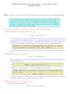
math.ucdenver.eduSo, combining 0 liminf js nj liminf js nj limsupjs nj limsupjs nj= 0 leads us to: 0 liminf js nj limsupjs nj= 0; which leads to liminf js nj= limsupjs nj= 0: By Theorem 10.7.ii, we conclude that limjs nj= 0: …

Hadamard Matrices and Designs
math.ucdenver.eduHadamard matrix are permuted, the matrix remains Hadamard. It is also true that if any row or column is multiplied by -1, the Hadamard property is retained. [Prove this] Thus, it is always possible to arrange to have the first row and first column of an Hadamard matrix contain only +1 entries. An Hadamard matrix in this form is said to be ...

Combinatorial Proofs
math.ucdenver.eduBinomial Theorem Notice that each term of the binomial expansions is a product composed of one item of each color. This suggests another way to look at this process of multiplication. Think of each factor in the product as a box containing two items, an x and a y (the colors are used here to keep track of which box an x or a y came from). We
Chapter 2: Frequency Distributions and Graphs (or making ...
math.ucdenver.eduFrequency distribution – the organization of raw data in table form, using classes and frequencies. Class – a quantitative or qualitative category. A class may be a range of numerical values (that acts like a “category”) or an actual category. Frequency – the number of data values contained in a specific class.
Finite Fields - Mathematical and Statistical Sciences
math.ucdenver.eduConstructing Finite Fields Another idea that can be used as a basis for a representation is the fact that the non-zero elements of a finite field can all be written as powers of a primitive element. Example: Let ω be a primitive element of GF(4). The elements of GF(4) are then 0, ω, ω2, ω3. Multiplication is easily done in this

Tutorial for the R Statistical Package
math.ucdenver.eduThis software can also be downloaded for free by anyone from various sites around the world. Let’s first start by downloading and installing R on your machine. After con-necting to the internet go to: www.r-project.org. From here select CRAN from the menu on the left side of the page. On the next page select a mirror from
Related documents
jmp.com/learn rev 07/2012 Bar Charts and Frequency ...
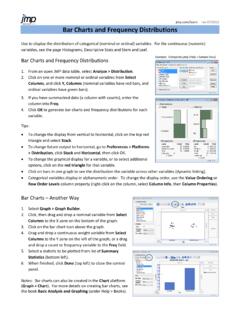
www.cs.uni.eduBar Charts and Frequency Distributions Use to display the distribution of categorical (nominal or ordinal) variables. For the continuous (numeric) variables, see the page Histograms, Descriptive Stats and Stem and Leaf. Bar Charts and Frequency Distributions 1. From an open JMP data table, select Analyze > Distribution. 2.
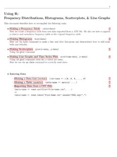
Using R: Frequency Distributions, Histograms, Scatterplots ...
cosmosweb.champlain.eduThen we created a relative and cumulative frequency table from this. Frequency Distribution: Males Scores Frequency 30 - 39 1 40 - 49 3 50 - 59 5 60 - 69 9 70 - 79 6 80 - 89 10 90 - 99 8 Relative Frequency Distribution: Males Relative Scores 30 - 39 2.4% 40 - 49 7.1% 50 - 59 11.9% 60 - 69 21.4% 70 - 79 14.3% 80 - 89 23.8% 90 - 99 19.0% ...
AP Statistics: Study Guide - EBSCO Connect
support.ebsco.comA relative frequency table gives the proportion of the total that is accounted for by each category. For example, in the previous data, 14 of the 50 cars, or 28%, were black. The full relative frequency table is as follows: Color Relative Frequency Black 28% Red 12% Blue 10% Silver 22% White 12% Green 6% Yellow 2% Grey 8%

in Public Health Practice
www.cdc.govNov 04, 2011 · Prepare and apply tables, graphs, and charts such as arithmetic-scale line, scatter diagram, pie chart, and box plot. Describe the processes, uses, …
WORKSHEET – Extra examples
www.math.utah.edu2.1 Frequency Distributions and Their Graphs Example 1: The following data set lists the midterm scores received by 50 students in a chemistry class: 45 85 92 99 37 68 67 78 81 25 97 100 82 49 54 78 89 71 94 87 21 77 81 83 98 97 74 81 39 77
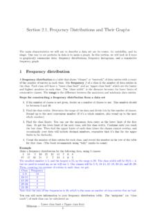
Section 2.1, Frequency Distributions and Their Graphs
www.math.utah.eduSection 2.1, Frequency Distributions and Their Graphs The main characteristics we will use to describe a data set are its center, its variability, and its shape. One way to see patterns in data is to make a graph. In this section, we will look at 3 ways to graphically summarize data: frequency distributions, frequency histograms, and a cumulative
![Describing and Comparing Data Distributions [Teacher Version]](/cache/preview/4/8/8/1/a/a/7/d/thumb-4881aa7da51f684046f4244443a3c04f.jpg)
Describing and Comparing Data Distributions [Teacher Version]
www2.census.govdifferent levels (city or town, county, and state) to compare and contrast the distributions of these variables in graphs, analyzing the shape, center, and spread of each. Suggested Grade Level: 9 Approximate Time Required: ... • Frequency – the number of times a value occurs in a data set • Interquartile range (IQR) – a measure of ...
Frequency Distributions - University of Notre Dame
www3.nd.eduFrequency Table or Frequency Distribution Example: Data Set 1 Here are frequency distributions for the data on eye color and number of pets owned. (Note that we lose some information from our original data set by separating the data) Eye Color # of Students (Category) ( Frequency) Blue 4 Brown 6 Gray 2 Hazel 5 Green 3 Total 20 # Pets # of Students