Transcription of 31 Misleading Graphs and Statistics
1 31 Misleading Graphs and StatisticsIt is a well known fact that Statistics can be Misleading . They are often usedto prove a point, and can easily be twisted in favour of that point! The pur-pose of this section is to learn how to recognize common statisitcal deceptionso that to avoid being SamplingWhen you use a sample to represent a larger group, you must make sure thatthe people in the sample are fairly representative of the larger whether a mall is a good place to find a sample for a survey aboutthe amount of allowance received by people ages 10 to mall is probably not a representative place to find a fair sample of peo-ple in this age range.
2 Taking a sample at the mall might not represent fairlythose people who receive a small allowance, or noneMisleading GraphsGood Graphs are extremely powerful tools for displaying large quantities ofcomplex data; they help turn the realms of information available today intoknowledge. But, unfortunately, some Graphs deceive or mislead. This mayhappen because the designer chooses to give readers the impression of betterperformance or results than is actually the situation. In other cases, the per-son who prepares the graph may want to be accurate and honest, but maymislead the reader by a poor choice of a graph form or poor graph following things are important to consider when looking at a graph:1.
3 Title2. Labels on both axes of a line or bar chart and on all sections of a pie chart3. Source of the data4. Key to a pictograph5. Uniform size of a symbol in a pictograph6. Scale: Does it start with zero? If not, is there a break shown7. Scale: Are the numbers equally spaced?1 Scaling and Axis ManipulationA graph can be altered by changing the scale of the graph. For example,data in the two Graphs of Figure are identical, but scaling of the Y-axischanges the impression of the magnitude of does the bar chart below Misleading ? How should the information berepresented? bar chart indicates that house prices have tripled in one year.
4 The scaleof vertical must start at 0 and that s not the case. A less Misleading graphwould look like the one in Figure This gives a much more accuratepicture of what has is wrong with the information represented on this graph? the vertical scale starts at 0, it does not go up in even steps. Thisdistorts the graph, and makes it look as though the biggest jump is between1 and 2 rather than 3 and 4. Also, there are no labels on the axes so we haveno idea what this graph represents!Three Dimensional EffectsExample is wrong with this 3D bar chart? 3D bar chart might look very attractive, but it is also very is no scale on the vertical axis, and because of the perspective it looksas though the sales for 1995 were far greater than those for any other fact they were identical to those for 1997.
5 It would be much better todraw a 2D bar chart like the one shown in Figure with the appropriatelabelling on each axis:Figure PictographsExample is wrong with this pictogram showing the number of people who owndifferent types of pets? this pictogram there isn t a category for those people who do not own apet. The pictures are different sizes and it appears that more people own ahorse than any other improvement would be to redraw the pictogram with each of the animalsthe same size and aligned with one another as shown in Figure survey was conducted to determine what food would be served at the5 French club party.
6 Explain how the graph misrepresents the percents on the circle graph do not sum to number of graduates from a community college for the years 1999 through2003 is given in the following table:Year1999 2000 2001 2002 2003# of Graduates 140 180 200 210 160 The figure below shows the line Graphs of the same data but with differentscales. Comment on two Graphs do not convey the same message. In Figure (b) the spac-ing of the years on the horizontal axis is more spread out and that for thenumbers on the vertical axis is more condensed than Figure (a). A collegeadministrator might use a graph like Figure (b) to convince people that thecollege was not in serious enrollment ProblemsProblem averaged 70 on her quizzes during the first part of the quarter and 80on her quizzes during the second part of the quarter.
7 When she found outthat her final average for the quarter was not 75, she went to argue with herteacher. Give a possible explanation for Jenny s the following circle Graphs are used to illustrate the fact that thenumber of elementary teaching majors at teachers colleges has doubled be-tween 1993 and 2003, while the percent of male elementary teaching majorshas stayed the same. What is Misleading about the way the Graphs are con-structed?Problem is wrong with the following line graph?7 Problem s Dog Food Company wanted to impress the public with the magnitudeof the company s growth. Sales of Doug s Dog Food had doubled from 2002to 2003, so the company displayed the following graph, in which the radiusof the base and the height of the 2003 can are double those of the 2002 does the graph really show with respect to the growth of the company?
8 Problem s wrong with the following graph?8 Problem to the following pictograph:Ms McNulty claims that on the basis of this information, we can concludethat men are worse drivers than women. Discuss whether you can reachthat conclusion from the pictograph or you need more information. If moreinformation is needed, what would you like to know?Problem and Marc took the same courses last quarter. Each bet that he wouldreceive the better grades. Their courses and grades are as follows:CourseLarry s GradesMarc s GradesMath(4 credits)ACChemistry(4 credits) ACEnglish(3 credits)BBPsychology(3 credits) CATennis(1 credit)CA9 Marc claimed that the results constituted a tie, since both received 2 A s,1 B, and 2 C s.
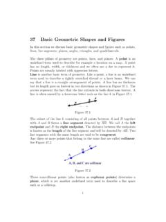
9 Larry said that he won the bet because he had the higherGPA for the quarter. Who is correct?(Allow 4 points for A, 3 points for B,2 points for C, 1 point for D, and 0 point for F.)Problem prices went up 20% one year and 30% the next. Is it true that over thetwo years, prices went up 50%?Problem or false? My rent went down 10% last year and then rose 20% this the two years my rent went up by 10%.Problem graph could be used to indicate a greater decrease in the price ofgasoline?