Transcription of COLOR Theory - North Thurston Public Schools
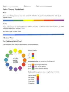
1 COLOR TheoryThe COLOR Wheel The COLOR wheel shows relationships between the colors. Artists often use the COLOR wheel to help understand how colors relate to one another. The COLOR Wheel Primary, Secondary, & Tertiary Colors Warm Colors Cool Colors Neutrals Monochromatic Complementary Analogous Mixing Colors COLOR MeaningThe COLOR Wheel Primary Colors Secondary Colors Tertiary ColorsPrimary ColorsThe primary colors are red, blue, and colors cannot be made from other Colors The secondary colors are orange, green, and purple. Secondary colors are made from mixing the primary colors. Tertiary Colors Mixing primary and secondary colors creates tertiary colors include: 1)Red-Violet 2)Blue-Violet 3)Blue-Green 4)Yellow Green 5)Red-Orange 6)Yellow-Orange On the COLOR wheel, the tertiary colors are located between the primary and secondary colors they are made from.
2 Complementary Colors Complementary colors are the colors that are directly across from each other on the COLOR wheel: Blue & Orange Red & Green Purple & YellowComplementary Colors Red and green are an example of complementary colors. Look at the painting Carnation, Lily, Lily, Rose by John Singer Sargent. The reddish-pink COLOR of the flowers really stands out against the green background. Imagine if Sargent had painted all yellow or blue flowers instead. They would just blend in with the green (ho-hum). COLOR schemesWarm Colors The warm colors are red, orange, yellow, and anything in between. They are called warm because they remind you of the sun or fire. Warm colors seem to come out at you in space. Warm ColorsIn The Fighting Temeraire by William Turner, the warm colors of the sunset give a feeling of brightness and heat. Look at the red spreading from the setting sun and the deep golden glow on the water.
3 If you're feeling cold, looking at colors like these can actually make you feel warmer!Cool Colors The Cool colors are blue, green, purple and anything in between. They are called cool because they remind you of the earth or a cool creek. Cool colors seem to recede from you in space. Cool ColorsIn this painting by Claude Monet, The Walk, Lady with a Parasol , the cool colors of the ground and sky contributes to the peaceful feeling of the painting. Imagine how different the painting would look with a bright red sky it might seem more exciting or energetic than Colors These colors are located next to each other on the wheel, such as: Blue, Blue-green, Green Red, Red-Orange, and Orange Analogous colors are sometimes called harmonious COLOR Scheme Any two or more adjacent to each other on the COLOR wheel, neighbors on the COLOR wheel. Warm & Cool COLOR can be placed in this category.
4 Analogous ColorsOrange, yellow-orange, and yellow are also examples of analogous colors. They are blended nicely in Sunflowers, a painting by Vincent Van Gogh. How do you know that these colors are closely related? They share a COLOR each of them contains some Neutrals don't usually show up on the COLOR wheel. Neutrals include black, white, gray, and sometimes brown and beige. They are sometimes called earth tones. There are a few different ways to make neutrals. You can blend black and white to make gray. You can create brown in two ways by blending two complementary colors together or by blending all three primary colors Colors A monochromatic scheme consists of different values (tints and shades) of a single COLOR . An example of a monochrome COLOR scheme could include any COLOR mixed with white or black. The example above is a green monochromatic COLOR scheme.
5 A shade of green is made by mixing green and black. A tint of green is made by mixing green and COLOR Scheme Artist uses one COLOR and some of its tints ( COLOR + white) and shades ( COLOR + black). The intermediate COLOR associated with it is also included. (Ex: BLUE COLOR scheme can include blue-green and blue-violet. COLOR MIXING It's easy to mix COLOR pencils to make new colors. You can use the primary colors (red, blue, and yellow) plus black and white to get all of the colors of the rainbow! COLOR MIXINGP rimary + SecondaryWhen you mix the Primary Colors together, you get the Secondary Colors. Red + Yellow =Red + Blue =Blue + Yellow =OrangeGreenPurpleValue, Tints, & Shades Value: is the lightness or darkness of a COLOR is called its value. Tints are light values that are made by mixing a COLOR with white. For example, pink is a tint of red (red+white), and gray is a tint of black (black+white).)
6 Shades are dark values that are made by mixing a COLOR with black. Maroon is a shade of red, and navy is a shade of MIXINGThis painting by Vincent Van Gogh, Fields in a Rising Storm, has tints and shades of blue in the sky, and tints and shades of green in the MIXINGT ints and ShadeThe Meaning of COLOR -Red Red is the COLOR of fire. It is associated with energy, war, danger, strength, power, determination and love. Red is a very emotionally intense COLOR . It enhances human metabolism, increases respiration rate, and raises blood pressure. It has very high visibility, which is why stop signs, stoplights, and fire equipment are usually painted red. It is a COLOR found in many national flags. Red brings text and images to the foreground. Use it as an accent COLOR to stimulate people to make quick decisions; it is a perfect COLOR for 'Buy Now' or 'Click Here' buttons on Internet banners and websites.
7 Red is widely used to indicate danger (high voltage signs, traffic lights). The Meaning of COLOR -Orange Orange combines the energy of red and the happiness of yellow. It is associated with joy, sunshine, and the tropics. Orange represents enthusiasm, fascination, happiness, creativity, determination, attraction, success, and encouragement. To the human eye, orange is a very hot COLOR , so it gives the sensation of heat. Nevertheless, orange is not as aggressive as red. Orange increases oxygen supply to the brain, produces an invigorating effect, and stimulates mental activity. As a citrus COLOR , orange is associated with healthy food and stimulates appetite. Orange is the COLOR of fall and harvest. Orange has very high visibility, so you can use it to catch attention and highlight the most important elements of your design. The Meaning of COLOR -Yellow Yellow is the COLOR of sunshine.
8 It's associated with joy, happiness, intellect, and energy. Yellow produces a warming effect, arouses cheerfulness, stimulates mental activity, and generates muscle energy. Yellow is often associated with food. Bright, pure yellow is an attention getter, which is the reason taxicabs are painted this COLOR . When overused, yellow may have a disturbing effect; it is known that babies cry more in yellow rooms. Yellow is seen before other colors when placed against black; this combination is often used to issue a warning. Use yellow to evoke pleasant, cheerful feelings. Yellow is very effective for attracting attention, so use it to highlight the most important elements of your design. Shades of yellow are visually unappealing because they loose cheerfulness and become dingy. The Meaning of COLOR -Green Green is the COLOR of nature. It symbolizes growth, harmony, and freshness.
9 Green has strong emotional correspondence with safety. Dark green is also commonly associated with money. Green has great healing power. It is the most restful COLOR for the human eye; it can improve vision. Green suggests stability and endurance. Sometimes green denotes lack of experience; for example, a 'greenhorn' is a novice. Green, as opposed to red, means safety; it is the COLOR of free passage in road traffic. Green is directly related to nature, so you can use it to promote 'green' products. Dull, darker green is commonly associated with money, the financial world, banking, and Wall Street. Dark green is associated with ambition, greed, and jealousy. Olive green is the traditional COLOR of Meaning of COLOR -Blue Blue is the COLOR of the sky and sea. It symbolizes trust, loyalty, wisdom, confidence, intelligence, and truth.
10 Blue is considered beneficial to the mind and body. It slows human metabolism and produces a calming effect. Blue is strongly associated with tranquility and calmness. Blue is used to promote products and services related to cleanliness (water purification filters, cleaning liquids), air and sky (airlines, airports, air conditioners), water and sea (sea voyages, mineral water). When used together with warm colors like yellow or red, blue can create high-impact, vibrant designs; for example, blue-yellow-red is a perfect COLOR scheme for a superhero. The Meaning of COLOR -Purple Purple combines the stability of blue and the energy of red. Purple is associated with royalty. It symbolizes power, nobility, luxury, and ambition. It conveys wealth and extravagance. Purple is associated with wisdom, dignity, independence, creativity, mystery, and magic.