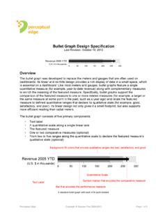
Transcription of Effectively Communicating Numbers - Perceptual Edge
1 EMBARKING ON A NEW JOURNEY Effectively Communicating Numbers Selecting the Best Means and Manner of Displayby Stephen FewPrincipal, Perceptual Edge November 2005 Effectively Communicating Numbers with ProClarity SPECIAL ADDENDUM 2005 ProClarity Corporation. All rights reserved. No portion of this report may be reproduced or stored in any form without prior written white paper is for informational purposes only. PROCLARITY MAKES NO WARRANTIES, EXPRESS OR IMPLIED, IN THIS DOCUMENT. It may not be duplicated, reproduced, or transmitted in whole or in part without the express permission of the ProClarity Corporation, 500 South 10th Street, Boise, Idaho 83702.
2 For more information, contact ProClarity: Phone: 208-343-1630. All rights reserved. All opinions and estimates herein constitute our judgment as of this date and are subject to change without OF CONTENTSE xecutive Summary ..1 Introduction ..2 General Concepts and Practices ..4 Tables versus Graphs ..4 Quantitative versus Categorical Data ..5 The Seven Common Relationships in Quantitative Business Data ..6 The Best Means to Encode Quantitative Data in Graphs ..10 The Best Practices for Formatting Graphs to Remove Distractions.
3 13A Step-By-Step Graph Selection and Design Process ..13 Determine Your Message and Identify Your Data ..13 Determine If a Table, Graph, or Both Is Needed to Communicate Your Message ..14 Determine the Best Means to Encode the Values ..14 Determine Where to Display Each Variable ..15 Determine the Best Design for the Remaining Objects ..15 Determine If Particular Data Should Be Featured, and If So, How ..20 Conclusion ..22 About the Author ..23 Appendix A: Steps in Designing a Graph ..23 Addendum from ProClarity CorporationEffectively Communicating Numbers with ProClarity.
4 23 Best Practices for Formatting Graphs to Remove Distractions ..23 Determine If a Table, Graph, or Both Is Needed to Communicate Your Message ..24 Determine Where to Display Each Variable ..29 Legend Placement ..30 Copyright Perceptual Edge 20051 EXECUTIVE SUMMARYThe ability to display data graphically is not intuitive; it requires a set of visual design skills that must be learned. Based on the recent book, Show Me the Numbers : Designing Tables and Graphs to Enlighten, this white paper will introduce the best practices in graph design.
5 No information is more important to a business than quantitative information the Numbers that measure performance, identify opportunities, and forecast the future. Quantitative information is often presented in the form of graphs. Unfortunately, most graphs used in business today are poorly designed often to the point of misinformation. Why? Because almost no one who produces them, including specialists such as financial analysts and other report developers, have been trained in effective graph design. This white paper is designed to provide a practical introduction to graph design developed specifically for the needs of business.
6 Following these clear precepts, communicated through examples of what works and what doesn t, you will learn a step-by-step process to present your data clearly and drive your message Will Learn To: Match your message to the right type of display Design each component of your graphs so the data speaks clearly and the most important data speaks loudly ProClarity sponsored this white paper in order to help people understand and design the most effective ways to present quantitative information in general or while using ProClarity business intelligence solutions.
7 Copyright Perceptual Edge 20052 INTRODUCTIONI magine that it is Thursday afternoon and an email from your boss suddenly appears in your inbox. With a sigh you wonder, What s Sue want this time? You open the email and here s what she says:I ve interviewed three people for the new Customer Service Manager position and need to summarize their qualifications for Jeff [the big boss]. He wants to choose the best candidate as objectively as possible. After the colossal failure of my last hire, he no longer trusts my instincts.
8 I ve attached a spreadsheet that rates each of the candidates according to the six areas of competence that we use for performance reviews (experience, communication, etc.). Please create a report that I can pass on to Jeff that presents me findings. I ll need it on my desk first thing requests like this is your job, but you ve never before been asked to present the qualifications of potential hires. Not only do you want to impress Sue, but here s a chance to impress the big boss as well. Obviously, you ve got to pull something great out of your hat not any old table or graph will do.
9 You run through the list of possibilities and select what you hope will win the day. Here s what you have waiting on Sue s desk the next run-of-the-mill employee would think to use a radar chart. You figure that a bar chart would have been mundane, but the radar chart shown in figure 1 looks very cool, very cutting edge. At about 8:30 AM you receive another email from Sue. It says Great Job!!! following by a smiley face. You begin imagining what you will do with the raise you certainly truth, however, a radar chart is not the best fit for this particular data and purpose.
10 It unnecessarily complicates an otherwise simple message. In this case a plain old table, like the one in table 2, would have communicated much more clearly. It s not fancy, but if the goal is communication leading to understanding, this table works exceptionally well. Jeff, the big boss, would have no difficultly making sense of it. The three candidates are ranked in the order of their overall qualifications ( Average Rating ) from left to right. Comparisons between their qualifications in any single area (for example, Subject Matter knowledge ) can be easily made given this tabular arrangement of the 1: This is an actual example of a software vendor s (not ProClarity) idea of an effective Perceptual Edge 20053 Scenarios such as this are not unusual.