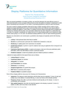
Transcription of Introduction to Geographical Data Visualization
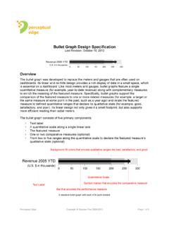
1 Copyright 2009 Stephen Few, Perceptual EdgePage 1 of 11 The important stories that numbers have to tell often involve location where things are or where they ve occurred. When we display quantitative information on a map, we combine visual displays of both abstract and physical data . Quantitative information is abstract it doesn t have physical form. Whenever we represent quantitative data visually, whether on a map or otherwise, we must come up with visual objects that represent abstract concepts in a clear and understandable manner, such as sales are going up, represented by a line, or expenses have deviated from the budget in both directions during the course of the year, represented by bars extending up or down from a baseline of nFebMa rAprMa yJunJu lAugSe pOctNo vDecSales in Dollars-8,000-6,000-4,000-2,00002,0004,0 006.
2 000 JanFebMarAprMayJunJulAugSepOctNovDecDevi a on f rom Expense Budget in DollarsGeographical information on the other hand is physical. When we display it, we do our best to represent those physical characteristics of land masses, bodies of water, terrain, roads, and so on, that concern us. On the following map, the land masses and bodies of water represented are physical, but the political boundaries and the red circles, which represent Internet usage in 2005, are to Geographical data Visualization Stephen Few, Perceptual EdgeVisual Business Intelligence NewsletterMarch/April 2009 perceptualedgeCopyright 2009 Stephen Few, Perceptual EdgePage 2 of 11We represent physical reality on a map in ways that leave out those aspects that aren t pertinent to the task at hand.
3 Otherwise, rather than a map, we would rely entirely on satellite photographs, which provide an accurate 2-D representation of geography. The red icon labeled A below marks the location of my house in Berkeley, California, as photographed from a satellite and displayed by Google photographs of a Geographical region work well for some purposes but poorly for others. While viewing my community in this way, my eyes are drawn to the expanse of open space on the right, which is Tilden Regional Park where I often hike. My eyes are also drawn to the two athletic fields in the lower left. Looking further, I notice that there appear to be more trees in the hills where I live than in the flatlands a short walk down the road.
4 What I can t get from this view, however, is a clear sense of where I live in relation to familiar streets. Copyright 2009 Stephen Few, Perceptual EdgePage 3 of 11In the view below, streets and their names have been overlaid on top of the photo to make them easier to see and this view on my large computer screen, I can now get a better sense of where I live in relation to other street locations that are familiar, but I have to work fairly hard, because there are too many details in the photo that distract me from the information that I currently need. In the next view, this problem has been corrected by switching to Google s map details that don t concern me have been removed and the features that I care about mostly the streets have been abstracted from their true physical appearance and simplified in a way that allows me to see only what s useful, without distraction from anything that isn 2009 Stephen Few, Perceptual EdgePage 4 of 11 Different representations of geography are required for different tasks.
5 Cartographers spend years learning how to design maps to specifically and effectively support their many uses. When we add quantitative information like sales or levels of Internet usage to a map, we must take care just as cartographers do to design an effective display for the task at for Encoding Quantitative data on a MapMany of the visual objects that represent data well in graphs, such as bars and lines, do not work well on maps. In the following example, it isn t easy to compare the lengths of bars except for those that are immediately next to one graphs rely on our natural ability to compare the lengths of objects such as bars by arranging them side by side along a common baseline.
6 Because the sets of bars that appear on this map are positioned in various Geographical locations and therefore don t share a common baseline, our ability to compare values is impaired. Besides this problem, on many maps there simply wouldn t be enough room to place bar charts everywhere they re needed without overlapping them, which would make many unreadable due to approaches to displaying quantitative information on maps usually work best: variations in color intensity, in size, or both. The map below, which I borrowed from Gretchen Peterson s excellent new book GIS Cartography: A Guide to Effective Map design , illustrates the use of color intensity for displaying quantities.
7 Imagine that this is a country divided into provinces, and that various intensities of the color orange are being used to encode average household income the darker the color the greater the income. This approach displays an aggregate measure for each province rather than a measure for each household. Geographical displays of this type are called choropleth 2009 Stephen Few, Perceptual EdgePage 5 of 11 The next map below uses circles that vary in size to encode differences in value the larger the greater. Imagine that each circle represents a retail store and that their sizes indicate the amount of sales at this case, rather than displaying an aggregated value per state, each circle marks the location of an individual store.
8 This design allows us to see a level of detail that would be lost had we color-encoded entire regions as done on the choropleth map. Both are valid approaches; they simply serve different this map, if we wanted to see sales aggregated to the state level instead of individual stores, we could color code each state or we could instead display circles (or some other simple symbol) of various sizes, one per state. This is often the better method because on choropleth maps, because large areas of color stand out more than small areas of the same exact color, we tend to notice them more, even though both have the same value.
9 Before we depart from this topic, let me mention another guideline to keep in mind when encoding quantitative values as color. Avoid the use of rainbow colors several distinct hues when displaying a quantitative range. Looking at the eight colors below, assuming that they represent different quantitative values, try to put them in order from least to 2009 Stephen Few, Perceptual EdgePage 6 of 11We don t perceive distinct hues as ordered they re simply different. Hues like those above work great for separating items on a map or graph into different groups, such as blue for Democrats and red for Republicans, but they don t work for the expression of quantitative differences.
10 The following colors, alternatively, do the job colors work because they vary not by hue but by intensity from light and lowly saturated to dark and fully saturated, which we intuitively perceive as for Featuring the data , Not the MapWhen we display quantitative information on a map, the map should only include those Geographical features that are needed to provide meaningful context for the data . Maps that we use for driving directions, thanks to the free services of Google, MapQuest, Yahoo, Microsoft, and others, are not ideally designed for most data displays. The information that s useful for driving is rarely useful for displaying quantitative data .