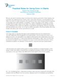
Practical Rules for Using Color in Charts - …
Practical Rules for Using Color in Charts Stephen Few
Download Practical Rules for Using Color in Charts - …

Information
Domain:
Source:
Link to this page:
Documents from same domain
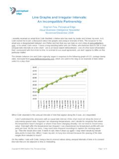
Line Graphs and Irregular Intervals - Perceptual Edge
www.perceptualedge.comLine Graphs and Irregular Intervals Stephen Few
much more than being about graphics, the visual …
www.perceptualedge.comMade to Stick devotes most of its pages to practical answers to the particular communication challenge it addresses: to make good ideas heard, understood, and remembered, and to provide guidance for how to respond.
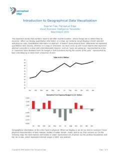
Introduction to Geographical Data Visualization
www.perceptualedge.comCartography: A Guide to Effective Map Design, ... Introduction to Geographical Data Visualization Stephen Few Data Visualization GIS, maps, geographical data, geospatial data, Perceptual Edge, Stephen Few, Show Me the Numbers, Information Dashboard Design, information visualization, data visualization, mashup, mash-up ...
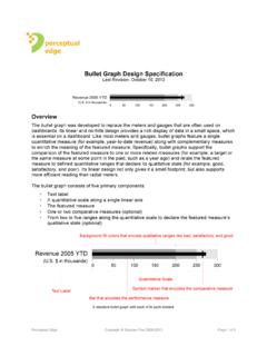
Bullet Graph Design Specification - Perceptual Edge
www.perceptualedge.comPerceptual Edge Copyright © Stephen Few 2006-2013 Page 3 of 5 Formatting Defaults: • Position.Centered in the plot area with the endpoint aligned with its value ...
Display Platforms for Quantitative Information
www.perceptualedge.comTitle: Display Platforms for Quantitative Information Author: Stephen Few Subject: Data Visualization Keywords
Effectively Communicating Numbers - Perceptual Edge
www.perceptualedge.comEMBARKING ON A NEW JOURNEY Effectively Communicating Numbers Selecting the Best Means and Manner of Display by Stephen Few Principal, Perceptual Edge
Designing Effective Tables and Graphs - Perceptual Edge
www.perceptualedge.comTitle: Designing Effective Tables and Graphs Author: Stephen Few Subject: Table and Graph Design Keywords: Show Me the Numbers, Stephen Few, graph design, table design, data visualizations, quantitative relationships
Bullet Graph Design Specification - Perceptual Edge
www.perceptualedge.comPerceptual Edge Copyright © Stephen Few 2006-2013 Page 2 of 5 Two examples of multiple bullet graphs: one arranged horizontally and one vertically
Statistical Narrative: Telling Compelling Stories with …
www.perceptualedge.comCopyright © 2009 Stephen Few, Perceptual Edge Page 2 of 10 In this article we’ll talk about the primary media that carry stories from the mind of the storyteller ...
Data Visualization - Past, Present, and Future
www.perceptualedge.comTo understand current and future trends in the field of data visualization, it helps to begin with some historical context. Despite the fact that predecessors to data visualization date back to the 2nd century AD, most developments have occurred ... Past, Present, and Future
Related documents

SA-78 Display Screen Examples - Scantek, Inc
scantekinc.comDirect connection of microphone or accelerometer possible. (Using CCLD type microphone preamplifier NH-22) 2-channel input allows easy transfer function measurement in the field. Support for FFT processing and octave analysis (synthesized). Upper frequency limit of 80 kHz enables ultrasound analysis. Measurement results and waveform data …
TABLES, CHARTS AND GRAPHS - …
www.surgicalcriticalcare.netTABLES, CHARTS, AND GRAPHS / 75 CHAPTER TWELVE TABLES, CHARTS, AND GRAPHS Tables, charts, and graphs are frequently used in statistics to visually communicate data. Such illustrations are also a frequent first step in evaluating raw data for trends, data entry errors, and outlying
154-2010: Using PROC SGPLOT for Quick High …
support.sas.com1 Paper 154-2010 Using PROC SGPLOT for Quick High-Quality Graphs Susan J. Slaughter, Avocet Solutions, Davis, CA Lora D. Delwiche, University of California, Davis, CA
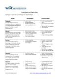
Using Graphs to Display Data - WHA Quality Center
www.whaqualitycenter.org(R 2-12) WHA Quality Center Source: http://math.youngzones.org/stat_graph.html Bar graph A bar graph displays discrete data in separate columns.

II-12Graphs - WaveMetrics
www.wavemetrics.netChapter II-12 — Graphs II-213 data readouts as you glide the cursors through your data (see Info Panel and Cursors).You can edit your data graphically (see Drawing and Editing Waves). Igor graphs are fast.
Paper 90-30 Tips and Tricks: Using SAS/GRAPH …
support.sas.com1 Paper 90-30 Tips and Tricks: Using SAS/GRAPH® Effectively A. Darrell Massengill, SAS Institute, Cary, NC ABSTRACT SAS/GRAPH is a powerful data visualization tool.
Line Graphs and Irregular Intervals - Perceptual Edge
www.perceptualedge.comLine Graphs and Irregular Intervals Stephen Few
Using Excel for Handling, Graphing, and Analyzing ...
academic.pgcc.eduUsing Excel for... Scientific Data 1 Using Excel for Handling, Graphing, and Analyzing Scientific Data Excel is a Microsoft computer application called a “spreadsheet.” It is designed to manage, manipulate, and display data. It has functions appropriate for business
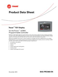
Product Data Sheet - Trane
www.trane.comNovember 2012 BAS-PRC068-EN Product Data Sheet Tracer™TD7 Display for theTracer™ UC600 Programmable Controller TheTracer™TD7 Display features a touch-sensitive color screen that provides for ease of viewing and editing ofTracer UC600 data. Building operators can easily monitor space temperature and relative humidity, change
Related search queries
Display, Using, Data, TABLES, CHARTS AND GRAPHS, TABLES, CHARTS, AND GRAPHS, TABLES, CHARTS, AND GRAPHS Tables, charts, and graphs, Using PROC SGPLOT for Quick High, Graphs, Using Graphs to Display Data, II-12Graphs, Tricks: Using SAS/GRAPH, Tricks: Using SAS/GRAPH® Effectively, Line Graphs and Irregular Intervals, For Handling, Graphing, and Analyzing, For Handling, Graphing, and Analyzing Scientific Data, Display data, Product Data Sheet, Trane