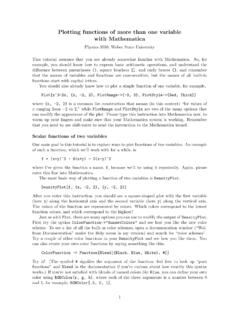
Transcription of Basic Graphics in R - Harvard University
1 Basic Graphics in RCCCB course on R and Bioconductor, Dec 2011,Aedin Culhane (My email is: start let s look at the Basic plots that can be produced inRusing thedemo()function> demo( Graphics )On startup,Rinitiates a Graphics device driver which opens a special Graphics window for the displayof interactive Graphics . If a new Graphics window needs to be opened ()orwindows()command can be the device driver is running,Rplotting commands can be used to produce a variety of graphicaldisplays and to create entirely new kinds of commands divided into three Basic functions c eate a new plot on the Graphics device, possibly with axes,labels, titles and so functions add more information to an existing plot , such as extra points,lines and functions allow you to interactively add information to, or extract infor-mation from the plotsIn addition,Rmaintains a list of graphical parameters which can be manipulated to customize High-level plotting functionsHigh-level plotting functions are designed to generate a complete plot of the data passed as argumentsto the function.)
2 Where appropriate, axes, labels and titles are automatically generated (unless yourequest otherwise). High-level plotting commands always start a new plot , erasing the current plotif The R function plot ()Theplot()function is one of the most frequently used plotting functions : This is a generic function, that is the type ofplotproduced is dependent on theclassof the first argument. plot of Vector(s)1. One vectorx(plots the vector against the index vector)> x <- 1:10> plot (x)2. Scatterplot of two vectorsxandy> (13)> x <- -30:30> y <- 3 * x + 2 + rnorm(length(x), sd = 20)> plot (x, y) plot If the first argument toplot()is , this can be as simplyasplot(x,y)providing 2 columns (variables in the ).Lets look at the data in airqualitywhich measured the 6 air quality in NewYork, on a daily basis between May to September 1973.
3 In total there are 154 observation(days).> airquality[1:2, ]Ozone Wind Temp Month Day1 41 190 67 5 12 36 118 72 5 2> plot (airquality)Multiple plots in the same window, attach/detach> par(mfrow = c(2, 1))> plot (airquality$Ozone, airquality$Temp, main = "airquality$Ozone,airquality$Temp")> attach(airquality)> plot (Ozone, Temp, main = " plot (Ozone, Temp)")> detach(airquality) Other high-level Graphics functions boxplot(x)a boxplot show the distribution of a vector. It is very useful to example the distri-bution of different variables.> boxplot(airquality) if you give plot a vector and factor plot (factor, vector) or plot (vector factor) it will producea boxplot.> par(mfrow = c(2, 2))> boxplot(airquality$Ozone ~ airquality$Month, col = 2:6, xlab = "month",+ ylab = "ozone", sub = "boxplot(airquality$Ozone~airquality$Mon th")> title("Equivalent plots")> plot (factor(airquality$Month), airquality$Ozone, col = 2:6, xlab = "month",+ ylab = "ozone", sub = " plot (factor(airquality$Month), airquality$Ozone")> plot (airquality$Ozone ~ factor(airquality$Month), col = 2.)))
4 6,+ sub = " plot (airquality$Ozone~factor(airquality $Month)")3llllll56789050100150boxplot(ai rquality$Ozone~airquality$Monthmonthozon eEquivalent plotsllllll56789050100150plot(factor(air quality$Month), airquality$Ozonemonthozonellllll56789050 100150plot(airquality$Ozone~factor(airqu ality$Month)factor(airquality$Month)airq uality$Ozone barplot plot a bar plot of the mean ozone quality by month. First use tapply to calculate themean of ozone by month> OzMonthMean <- tapply(airquality$Ozone, factor(airquality$Month),+ mean, = TRUE)> par(mfrow = c(1, 2))> barplot(OzMonthMean, col = 2:6, main = "Mean Ozone by month")456789 Mean Ozone by month01020304050 pie chart> pie(OzMonthMean, col = rainbow(5))556789 hist(x)- histogram of a numeric vectorxwith a few important optional arguments:nclass=for the number of classes, andbreaks=for the breakpoints> xt <- rt(100, 3)> hist(xt)> plot (density(xt)) Arguments to high-level plotting functionsaxes=FALSES uppresses generation of axes-useful for adding your own custom axes with theaxis()function.)))
5 The default, axes=TRUE, means include controls the type of plot produced, as follows:type= p plot individual points (the default)type= l plot linestype= b plot points connected by lines (both)type= o plot points overlaid by lines6type= h plot vertical lines from points to the zero axis (high-density)type= n No plotting at all. However axes are still drawn (by default) and the coordinate system isset up according to the data. Ideal for creating plots with subsequent low-level labels for the x and y axes. Use these arguments to change the default labels,usually the names of the objects used in the call to the high-level plotting title, placed at the top of the plot in a large , placed just below the x-axis in a smaller Examples of Plotting using different plot types and axes> xp <- 1:100/100> yp <- 3 * xp^2 - 2 * xp + rnorm(100, sd = )> par(mfrow = c(3, 2))> for (i in c("l", "b", "o", "h")) plot (xp, yp, type = i, main = paste(" plot type.))
6 ",+ i))> plot (xp, yp, type = "o", xlab = "index", ylab = "values", main = "R simple plot ")> plot (xp, yp, type = "l", axes = FALSE)> axis(1)> axis(2, at = c( , 0, , ), col = "blue")> axis(3, at = c(0, , , , 1), col = "red")> axis(4, col = "violet", = "dark violet", lwd = 2) type: type: type: type: simple Low-level plotting commandsSometimes the high-level plotting functions don t produce exactly the kind of plot you desire. Inthis case, low-level plotting commands can be used to add extra information (such as points, linesor text) to the current plot . Some of the more useful low-level plotting functions are:points(x, y)lines(x, y)Adds points or connected lines to the current (x, y, labels.
7 Add text to a plot at points given by x, y. Normally labels is an integer orcharacter vector in which case labels[i] is plotted at point (x[i], y[i]). The default is 1:length(x).Note: This function is often used in the sequenceThe Graphics parameter type= n suppresses the points but sets up the axes, and thetext()function supplies special characters, as specified by the character vector names for the (a, b)Adds a line of slope b and intercept a to the current (h=y)Adds a horizontal lineabline(v=x)Adds a vertical linepolygon(x, y, ..)Draws a polygon defined by the ordered vertices in (x, y) and (optionally) shadeit in with hatch lines, or fill it if the Graphics device allows the filling of (x, y, legend.)
8 Adds a legend to the current plot at the specified position. Plottingcharacters, line styles, colors etc., are identified with the labels in the character vector least one other argument v (a vector the same length as legend) with the correspondingvalues of the plotting unit must also be given, as follows:legend( , fill=v) Colors for filled boxeslegend( , col=v) Colors in which points or lines will be drawnlegend( , lty=v) Line styleslegend( , lwd=v) Line widthslegend( , pch=v) Plotting characterstitle(main, sub)Adds a title main to the top of the current plot in a large font and (optionally) asub-title sub at the bottom in a smaller (side, ..)Adds an axis to the current plot on the side given by the first argument (1 to 4,counting clockwise from the bottom.)
9 Other arguments control the positioning of the axiswithin or beside the plot , and tick positions and labels. Useful for adding custom axes aftercalling plot () with the axes=FALSE add greek characters, either specifiy font type 5 (see below) or use the functionexpression> plot (x, cos(x), main = expression(paste("A random eqn ", bar(x)) ==+ sum(frac(alpha[i] + beta[z], n))), sub = "This is the subtitle")Example using points lines and legend> attach(cars)> plot (cars, type = "n", xlab = "Speed [mph]", ylab = "Distance [ft]")> points(speed[speed < 15], dist[speed < 15], pch = "s", col = "blue")> points(speed[speed >= 15], dist[speed >= 15], pch = "f", col = "green")> lines(lowess(cars), col = "red")> legend(5, 120, pch = c("s", "f"), col = c("blue", "green"), legend = c("Slow",+ "Fast"))
10 > title("Breaking distance of old cars")> detach(2)To add formulae or greek characters to a plot > par(mfrow = c(2, 1))> x <- rexp(100, rate = )> hist(x, main = "Mean and Median of a Skewed Distribution")> abline(v = mean(x), col = 2, lty = 2, lwd = 2)> abline(v = median(x), col = 3, lty = 3, lwd = 2)9> ex1 <- expression(bar(x) == sum(over(x[i], n), i == 1, n), hat(x) ==+ median(x[i], i == 1, n))> legend( , 30, ex1, col = 2:3, lty = 2:3, lwd = 2)> x <- seq(-pi, pi, len = 65)> plot (x, sin(x), type = "l", col = "blue", xlab = expression(phi),+ ylab = expression(f(phi)))> lines(x, cos(x), col = "magenta", lty = 2)> abline(h = -1:1, v = pi/2 * (-6:6), col = "gray90")> ex2 <- expression(plain(sin) * phi, paste("cos", phi))> legend(-3, , ex2, lty = 1:2, col = c("blue", "magenta"), adj = c(0,+ ))Mean and Median of a Skewed DistributionxFrequency024681012140204060 x= i=1nxinx^=median(xi, i=1, n) 3 2 10123 f( )sin cos 10 III Interacting with graphicsRalso provides functions which allow users to extract or add information to a plot using a mouse vialocator()andverb+identify()functions respectively.