Transcription of Data Visualization - Past, Present, and Future
1 DATA Visualization . past , present , AND Future . STEPHEN FEW. PERCEPTUAL EDGE. Wednesday, January 10, 2007. INTRODUCTION. Data Visualization , the use of images to represent information, is only now becoming properly appreciated for the benefits it can bring to business. It provides a powerful means both to make sense of data and to then communicate what we've discovered to others. Despite their potential, the benefits of data Visualization are undermined today by a general lack of understanding. Many of the current trends in data Visualization are actually producing the opposite of the intended effect, confusion rather than understanding. Nothing going on in the field of business intelligence today can bring us closer to fulfilling its promise of intelligence in the workplace than data Visualization . But this will happen only if we understand it and use it properly.
2 We must embrace what really works and jettison the silly stuff that undermines data Visualization today. HISTORY OF DATA Visualization . To understand current and Future trends in the field of data Visualization , it helps to begin with some historical context. Despite the fact that predecessors to data Visualization date back to the 2nd century AD, most developments have occurred in the last two and a half centuries, predominantly during the last 30 years. Figure 1: History of data Visualization timeline The earliest table that has been preserved was created in the 2nd century in Egypt to organize astronomical information as a tool for navigation. A table is primarily a textual representation of data, but it uses the visual attributes of alignment, white space, and at times rules (vertical or horizontal lines) to arrange data into columns and rows.
3 Tables, along with graphs and diagrams, all fall into the class of data representations called charts. Although tables are predominantly 2 2007 Stephen Few. None of this paper's content may be altered in any way or published in part without the review and approval of the author. textual, their visual arrangement of data into columns and rows was a powerful first step toward later developments, which shifted the balance from textual and visual representations of data. The visual representation of quantitative data in relation to two-dimensional coordinate scales, the most common form of what we call graphs, didn't arise until much later, in the 17th century. Rene Descartes, the French philosopher and mathematician probably best known for the words Cogito ergo sum ( I think therefore I am ), invented this method of representing quantitative data originally, not for presenting data, but for performing a type of mathematics based on a system of coordinates.
4 Later, however, this representation was recognized as an effective means to present information to others as well. Following Descartes' innovation, it wasn't until the late 18th and early 19th centuries that many of the graphs that we use today, including bar charts and pie charts, were invented or dramatically improved by a Scottish social scientist named William Playfair. Over a century passed, however, before the value of these techniques became recognized to the point that academic courses in graphing data were finally introduced, originally at Iowa State University in 1913. The person who introduced us to the power of data Visualization as a means of exploring and making sense of data was the statistics professor John Tukey of Princeton, who in 1977 developed a predominantly visual approach to exploring and analyzing data called exploratory data analysis.
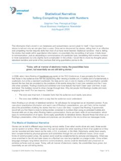
5 In 1983 data Visualization aficionado Edward Tufte published his groundbreaking book The Visual Display of Quantitative Information, which showed us that there were effective ways of displaying data visually and then there were the ways that most of us were doing it, which were sadly lacking in effectiveness. One year later, in 1984, while we were watching the Super Bowl, Apple Computer introduced the first popular and affordable computer that focused on graphics as a mode of interaction and display. This paved the way for the use of data visualizations that we could view and interact with using a computer. Given the availability of affordable computers with powerful graphics, a new research specialty emerged in the academic world, which was given the name information Visualization . In 1999 the book Readings in Information Visualization : Using Vision to Think collected this work into a single volume and made it accessible beyond the walls of academia.
6 In addition to these milestones in the development of data Visualization , another event in the second half of the 20th century greatly influenced the quality of data Visualization , but in the wrong direction: the proliferation of the IBM PC. Before the personal computer became commonplace in the workplace, if you needed to present data graphically, you were faced with a labor-intensive process involving the use of a T-square, draftsmen's triangles, and a collection of special pencils and pens. It sometimes took hours to produce a graph that could be displayed in a meeting or attached to a printed report. When the process took this much time and effort, people responsible for this work usually took time to develop graphical communication skills. But with the advent of the PC and the proliferation of business software such as the electronic spreadsheet, this changed.
7 With the PC, the click of a mouse could transform a host of numbers into a graph, 2007 Stephen Few. None of this paper's content may be altered in any way or published in part without the review and approval of the author. 3. and people who knew nothing about graph design suddenly became Rembrandts of graphical communication or so they imagined. Despite Edward Tufte's efforts beginning in the 1980s, the quality of data Visualization went largely ignored, especially in form of business graphs, despite their exponential growth. Now that the stage has been set with the backdrop of history, let's take a look at what's happening today. CURRENT TRENDS IN DATA Visualization . Today, data Visualization is increasingly taking its rightful place as an important part of business intelligence. It is being talked about, investigated, requested by people who work with data, purchased by people who hold the purse strings, and used by a growing percentage of people in the workforce, especially analysts.
8 That's the good news. The bad news is that, in the world of business, data Visualization is still mostly ignored, largely misunderstood, used ineffectively, and too often undermined by the very vendors that produce and sell Visualization software. The fact that you're reading this indicates that you want to learn about it and take full advantage of what it offers, so let's start with the good news and save the bad news as a warning about what to avoid for last. Good Trends Data Visualization has in recent years become an established area of study in academia. Many universities now have faculty members who focus on Visualization and a few have excellent programs that serve the needs of many graduate students who produce worthwhile research studies and prototype applications. This research community consists of people who are not just from computer science, but from many other disciplines as well, such as psychology and even business, which provides the context for a great deal of innovation while drawing on the robust practices of more mature disciplines.
9 We're beginning to see some data Visualization products that actually work well. It still represents the minority, but a growing minority. Most of the best commercial Visualization software has directly emerged from work that began as academic research. Efforts are currently under way, including my own, to bridge the gap between academic researchers with great ideas and business intelligence vendors who know how to build and sell commercially viable software products. One of the encouraging new trends in business intelligence is the growing recognition that the greatest benefits of data Visualization will come in the form of analytics. Visual analysis software allows us to not only represent data graphically, but to also interact with those visual representations to change the nature of the display, filter out what's not relevant, drill into lower levels of detail, and highlight subsets of data across multiple graphs simultaneously.
10 This makes good use of our eyes and assists our brains, resulting in insights that cannot be matched by traditional approaches. Static graphs delivered on paper or electronically on a computer screen help us communicate information in a clear and enlightening way, which is a benefit that should not be undervalued, but it is from visual analytics that businesses will derive the greatest benefits. 4 2007 Stephen Few. None of this paper's content may be altered in any way or published in part without the review and approval of the author. One of the most powerful techniques of visual analysis involves the simultaneous display of multiple graphs, which feature either different subsets of data taken from a larger data set, or different views of a shared data set. Edward Tufte popularized a form of display that he calls small multiples, which uses a series of small graphs arranged together within eye span so they can be compared.