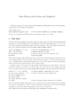
Basic Plotting with Python and Matplotlib
The basic syntax for creating line plots is plt.plot(x,y), where x and y are arrays of the same length that specify the (x;y) pairs that form the line. For example, let’s plot the cosine function from 2 to 1.
Download Basic Plotting with Python and Matplotlib

Information
Domain:
Source:
Link to this page:
Documents from same domain

Real Democracy: Post-Election Audits for Range Voting
courses.csail.mit.eduPost-Election Audit Threat Model. We cannot trust that the software in our electronic voting system produces the actual outcome for every contest. For instance, it could be that the software vendor of the system is biased towards a specific political party and/or that the software contains bugs.
50 years of Data Science - courses.csail.mit.edu
courses.csail.mit.eduData Science without statistics is possible, even desirable. Vincent Granville, at the Data Science Central Blog 7 Statistics is the least important part of data science.
A Message to Garcia Elbert Hubbard 1899
courses.csail.mit.educan carry a message to Garcia. I know one man of really brilliant parts who has not the ability to manage a business of his own, and yet who is absolutely worthless to anyone else, because he carries with him constantly the insane suspicion that his employer is oppressing, or intending to oppress, him.
50 years of Data Science - courses.csail.mit.edu
courses.csail.mit.eduA recent and growing phenomenon is the emergence of \Data Science" programs at major universities, including UC Berkeley, NYU, MIT, and most recently the Univ. of Michigan, which on September 8, 2015 announced a $100M \Data Science Initiative" that will hire 35 new faculty.

Practice Number Theory Problems
courses.csail.mit.edu6.857 : Handout 9: Practice Number Theory Problems 3 (b) Show that if a b mod n, then for all positive integers c, ac bc mod n. Since a b mod n, there exists q 2Z such that a = b + nq. This means that ac = (b + nq)c. If we compute mod n on both sizes, nqc cancels out and we obtain ac …

6.825 Exercise Solutions: Week 3 - courses.csail.mit.edu
courses.csail.mit.edu6.825 Exercise Solutions: Week 3 Solutions September 27, 2004 Converting to CNF Convert the following sentences to conjunctive normal form. 1. (A → B) → C
Basic Plotting with Python and Matplotlib
courses.csail.mit.eduplt.plot(xvals, newyvals, ’r--’) # Create line plot with red dashed line plt.title(’Example plots’) plt.xlabel(’Input’) plt.ylabel(’Function values’) plt.show() # Show the figure (remove the previous instance) The third parameter supplied to plt.plot above is …
6.825 Exercise Solutions, Decision Theory
courses.csail.mit.eduNo has a patient who is very sick. Without further treatment, this patient will die in about 3 months. ... might be able to gather more information about whether you’ll win the race by talking to your coach or the TV sports commentators. 3. Compute the expected value of perfect information about the state of your leg. Solution:
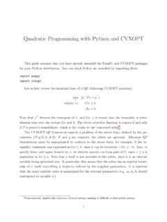
Quadratic Programming with Python and CVXOPT
courses.csail.mit.eduQuadratic Programming with Python and CVXOPT This guide assumes that you have already installed the NumPy and CVXOPT packages for your Python distribution.

4 Search Problem formulation (23 points)
courses.csail.mit.eduThe batteries can be charged by stopping and unfurling the solar collectors (pretend it’s always daylight). One hour of solar collection results in one unit of battery charge. The batteries can hold a total of 10 units of charge. • It can drive. It has a map at 10-meter resolution indicating how many units of battery charge
Related documents
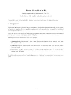
Basic Graphics in R - Harvard University
bcb.dfci.harvard.eduPlot of data.frame elements If the rst argument to plot() is a data.frame, this can be as simply as plot(x,y) providing 2 columns (variables in the data.frame). Lets look at the data in the data.frame airquality which measured the 6 air quality in New
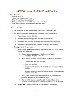
LabVIEW Lesson 6 – File I/O and Plotting
boson.physics.sc.eduLabVIEW Lesson 6 – File I/O and Plotting Lesson Overview • Why use file I/O? ... File I/O formats depend on the type of files being used. 3 types of formats exist: text, binary, and datalog. ... the plot lines, the type of data points (useful when plotting multiple sets of data), and many other options. ...
Using SAS’s PROC GPLOT to plot data and lines
cob.jmu.eduUsing SAS’s PROC GPLOT to plot data and lines PROC GPLOT creates “publication quality” color graphics which can easily be exported into documents, presentations, etc. To export the graphs for future use click on file, export. In the dialog box choose a
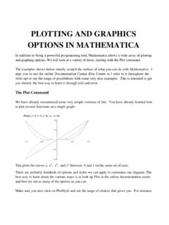
PLOTTING AND GRAPHICS OPTIONS IN MATHEMATICA
dslavsk.sites.luc.eduPLOTTING AND GRAPHICS OPTIONS IN MATHEMATICA In addition to being a powerful programming tool, Mathematica allows a wide array of plotting and graphing options. We will look at a variety of these, starting with the Plot command. ... Plot x, x^2, x^3, x ...

Unit 9 Describing Relationships in Scatter Plots and Line ...
lycofs01.lycoming.edu56 Unit 9 Describing Relationships in Scatter Plots and Line Graphs Objectives: • To construct and interpret a scatter plot or line graph for two quantitative variables
Math 141 - Quantile-Quantile Plots
people.reed.eduThe QQ plot The quantile–quantile plot, or QQplot, is a simple graphical method for comparing two sets of sample quantiles. Plot the pairs of order statistics (X (k);Y (k)): If the two datasets come from the same distribution, the points ... Math 141 - Quantile-Quantile Plots ...
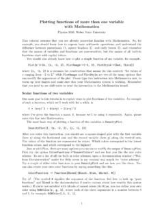
Plotting functions of more than one variable with Mathematica
physics.weber.eduPlotting functions of more than one variable with Mathematica Physics 3510, Weber State University This tutorial assumes that you are already somewhat familiar with Mathematica.
Split Plots - Statistics
users.stat.umn.eduAll split plots in the same whole plot get the same level of the whole plot treatment factor. All levels of the split plot treatment factor occur in each whole plot. The restricted randomization is equivalent to the two randomizations of the unit structure approach.
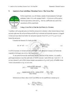
9. Analysis of an Acid-Base Titration Curve: The Gran Plot
web.mnstate.eduThe Gran plot in the acidic region gives accurate results even if there is CO2 dissolved in the strong base titrant. The Gran plot in the basic region can be used to measure CO2 in the strong base. For completeness, we note that if weak base, B, is titrated with a strong acid, the Gran
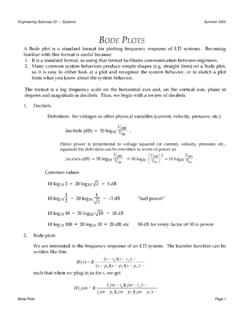
Bode plots
www.dartmouth.eduA Bode plot is a standard format for plotting frequency response of LTI systems. Becoming familiar with this format is useful because: 1. It is a standard format, so using that format facilitates communication between engineers. 2. Many common system behaviors produce simple shapes (e.g. straight lines) on a Bode plot,
Related search queries
Basic Graphics in R, Plot, Lesson 6, File I/O, The Plot, Using SAS’s PROC GPLOT to plot data, PLOTTING AND GRAPHICS OPTIONS IN, Describing Relationships in Scatter Plots, Math 141 - Quantile-Quantile Plots, Plotting functions of more than one variable with Mathematica, Split plots, Gran plot, Bode plot