
Marginal Model Plots - SAS Support
marginal model plot for each independent variable and one additional plot that displays the predicted values on the horizontal axis. Each plot contains a scatter plot of the two variables, a smooth fit function for the variables in the plot (labeled “Data”), and a function that displays the predicted values as a function of the ...
Download Marginal Model Plots - SAS Support

Information
Domain:
Source:
Link to this page:
Documents from same domain

027-2009: Tips and Tricks for Creating the Reports …
support.sas.comPaper 027-2009 TIPS AND TRICKS FOR CREATING THE REPORTS YOUR CLIENTS NEED TO SEE Michael J Molter, INC Research, Raleigh, NC ABSTRACT Advanced reporting tools such as PROC REPORT have progressed by leaps and …
Step-by-Step Programming with Base SAS Software
support.sas.comThe correct bibliographic citation for this manual is as follows: SAS Institute Inc. 2001. Step-by-Step Programming with Base SAS® Software.Cary, NC: SAS Institute Inc.
227-2012: Executing a PROC from a DATA Step - …
support.sas.com2 Using RUN_MACRO to execute a PROC from a DATA step requires writing three blocks of code, described in the Introduction: a macro to execute a PROC, a user-written function to execute the macro, and a DATA step to call the
149-2012: Queries, Joins, and WHERE Clauses, Oh …
support.sas.comPaper 149-2012 Queries, Joins, and WHERE Clauses, Oh My!! Demystifying PROC SQL Christianna S. Williams, Chapel Hill, NC ABSTRACT Subqueries, inner joins, outer joins, HAVING expressions, set operators…just the terminology of PROC SQL might
158-2010: How to Use Arrays and DO Loops: Do I …
support.sas.com1 Paper 158-2010 How to Use ARRAYs and DO Loops: Do I DO OVER or Do I DO i? Jennifer L Waller, Medical College of Georgia, Augusta, GA ABSTRACT
248-2009: Learning When to Be Discrete: …
support.sas.com1 Paper 248–2009 Learning When to Be Discrete: Continuous vs. Categorical Predictors David J. Pasta, ICON Clinical Research, San Francisco, CA ABSTRACT
338-2011: An Introduction to Survival Analysis …
support.sas.com2 (Censored) Study Ends (From Applied Survey Data Analysis, p. 306) Figure 1. Prospective View of Event History Survey Data Time can be regarded as continuous or discrete and this basic distinction affects the analytic approach selected.
Dongsheng Yang and Jarrod E. Dalton - SAS
support.sas.com1 Paper 335-2012 A unified approach to measuring the effect size between two groups using SAS® Dongsheng Yang and Jarrod E. Dalton Departments of Quantitative Health Sciences and Outcomes Research
SAS/STAT 9.2 User's Guide: Introduction to Power …
support.sas.comSAS/STAT ® 9.2 User’s Guide Introduction to Power and Sample Size Analysis (Book Excerpt) SAS® Documentation
249-2012: A Tutorial on the SAS® Macro Language
support.sas.com1 Paper 249-2012 A Tutorial on the SAS® Macro Language John J. Cohen, Advanced Data Concepts LLC, Newark, DE ABSTRACT The SAS macro language is another language layering on top of regular SAS code.
Related documents
Basic Graphics in R - Harvard University
bcb.dfci.harvard.eduPlot of data.frame elements If the rst argument to plot() is a data.frame, this can be as simply as plot(x,y) providing 2 columns (variables in the data.frame). Lets look at the data in the data.frame airquality which measured the 6 air quality in New
LabVIEW Lesson 6 – File I/O and Plotting
boson.physics.sc.eduLabVIEW Lesson 6 – File I/O and Plotting Lesson Overview • Why use file I/O? ... File I/O formats depend on the type of files being used. 3 types of formats exist: text, binary, and datalog. ... the plot lines, the type of data points (useful when plotting multiple sets of data), and many other options. ...
Using SAS’s PROC GPLOT to plot data and lines
cob.jmu.eduUsing SAS’s PROC GPLOT to plot data and lines PROC GPLOT creates “publication quality” color graphics which can easily be exported into documents, presentations, etc. To export the graphs for future use click on file, export. In the dialog box choose a
Basic Plotting with Python and Matplotlib
courses.csail.mit.eduThe basic syntax for creating line plots is plt.plot(x,y), where x and y are arrays of the same length that specify the (x;y) pairs that form the line. For example, let’s plot the cosine function from 2 to 1.
PLOTTING AND GRAPHICS OPTIONS IN MATHEMATICA
dslavsk.sites.luc.eduPLOTTING AND GRAPHICS OPTIONS IN MATHEMATICA In addition to being a powerful programming tool, Mathematica allows a wide array of plotting and graphing options. We will look at a variety of these, starting with the Plot command. ... Plot x, x^2, x^3, x ...

Unit 9 Describing Relationships in Scatter Plots and Line ...
lycofs01.lycoming.edu56 Unit 9 Describing Relationships in Scatter Plots and Line Graphs Objectives: • To construct and interpret a scatter plot or line graph for two quantitative variables

Math 141 - Quantile-Quantile Plots
people.reed.eduThe QQ plot The quantile–quantile plot, or QQplot, is a simple graphical method for comparing two sets of sample quantiles. Plot the pairs of order statistics (X (k);Y (k)): If the two datasets come from the same distribution, the points ... Math 141 - Quantile-Quantile Plots ...
Plotting functions of more than one variable with Mathematica
physics.weber.eduPlotting functions of more than one variable with Mathematica Physics 3510, Weber State University This tutorial assumes that you are already somewhat familiar with Mathematica.
Split Plots - Statistics
users.stat.umn.eduAll split plots in the same whole plot get the same level of the whole plot treatment factor. All levels of the split plot treatment factor occur in each whole plot. The restricted randomization is equivalent to the two randomizations of the unit structure approach.
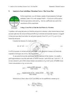
9. Analysis of an Acid-Base Titration Curve: The Gran Plot
web.mnstate.eduThe Gran plot in the acidic region gives accurate results even if there is CO2 dissolved in the strong base titrant. The Gran plot in the basic region can be used to measure CO2 in the strong base. For completeness, we note that if weak base, B, is titrated with a strong acid, the Gran
Related search queries
Basic Graphics in R, Plot, Lesson 6, File I/O, The Plot, Using SAS’s PROC GPLOT to plot data, Basic Plotting with Python and Matplotlib, PLOTTING AND GRAPHICS OPTIONS IN, Describing Relationships in Scatter Plots, Math 141 - Quantile-Quantile Plots, Plotting functions of more than one variable with Mathematica, Split plots, Gran plot