
Plotting Data with Microsoft Excel - Rice University
Plotting Data with Microsoft Excel Here is an example of an attempt to plot parametric data in a scientifically meaningful way, using Microsoft Excel. This example describes an experience using the Office X version for Macintosh. The details may change with different versions, but the principle
Download Plotting Data with Microsoft Excel - Rice University

Information
Domain:
Source:
Link to this page:
Documents from same domain
Chapter 2 Thermal Expansion - Rice University
www.owlnet.rice.eduTHE COEFFICIENT OF LINEAR thermal expansion (CTE, α, or α 1) is a material property that is indicative of the extent to which a mate-rial expands upon heating.
Chapter 7 Solution of the Partial Differential …
www.owlnet.rice.eduChapter 7 Solution of the Partial Differential Equations Classes of partial differential equations Systems described by the Poisson and Laplace equation
Notes on Analog Circuits - Rice University
www.owlnet.rice.edu1 PHYS 331: Junior Physics Laboratory I Notes on Analog Circuits Digital circuits deal, in principle, with only two values of voltage, whereas analog circuits

A Guide to DEAP Version 2.1: A Data ... - Rice …
www.owlnet.rice.eduA Guide to DEAP Version 2.1: A Data Envelopment Analysis (Computer) Program by Tim Coelli Centre for Efficiency and Productivity Analysis Department of Econometrics

Surface Area - Rice University
www.owlnet.rice.eduSurface Area The specific surface area is a dominant parameter in models for permeability and in the transport of a species that can adsorb on the mineral
Advanced Game Theory - Rice University
www.owlnet.rice.eduFinally, the founding result of Game Theory, known as the minimax theorem, says that optimal strategies exist when our players can randomize over a finite set of deterministic strategies. 1.2 Two-person zero-sum games in strategic form A two-person zero …
Exam 1 - Multiple Choice Questions - Rice University
www.owlnet.rice.eduIV. Q1 and Q2 have the same sign. V. Q1 and Q2 have different signs. (A) I and IV are correct. ... February 15, 2007 PHYS102 Exam #1 - Multiple-Choice Section Page 8 13. A charged metal ball is lowered into an insulated metal can and permitted to touch the inside ... Exam, PHYS102, Multiple Choice

MECH 401 Machine Design - Rice University
www.owlnet.rice.eduCharacterizing random variables A random variable is not a scalar, but rather a vector In this deterministic case, we can say x = 63.5 inches This is a scalar, since it has only a single value In the stochastic case, we know that the variable x can take on many values x = 63.5, 68.7, 62.1, etc We define the discrete random variable x to be a vector of the samples x

The Oscilloscope - Rice University
www.owlnet.rice.eduPHYS 112 The Oscilloscope 3 The vertical system accepts input signals and develops appropriate deflection voltages for the CRT. Because this is a two-channel scope there are two identical sets of vertical controls, one

ELECTRON SPIN RESONANCE - Rice University
www.owlnet.rice.eduelectron paramagnetic resonance, EPR, or electron spin resonance, ESR. The technique depends on the fact that certain atomic systems have a permanent magnetic moment.
Related documents
Basic Graphics in R - Harvard University
bcb.dfci.harvard.eduPlot of data.frame elements If the rst argument to plot() is a data.frame, this can be as simply as plot(x,y) providing 2 columns (variables in the data.frame). Lets look at the data in the data.frame airquality which measured the 6 air quality in New
LabVIEW Lesson 6 – File I/O and Plotting
boson.physics.sc.eduLabVIEW Lesson 6 – File I/O and Plotting Lesson Overview • Why use file I/O? ... File I/O formats depend on the type of files being used. 3 types of formats exist: text, binary, and datalog. ... the plot lines, the type of data points (useful when plotting multiple sets of data), and many other options. ...
Using SAS’s PROC GPLOT to plot data and lines
cob.jmu.eduUsing SAS’s PROC GPLOT to plot data and lines PROC GPLOT creates “publication quality” color graphics which can easily be exported into documents, presentations, etc. To export the graphs for future use click on file, export. In the dialog box choose a
Basic Plotting with Python and Matplotlib
courses.csail.mit.eduThe basic syntax for creating line plots is plt.plot(x,y), where x and y are arrays of the same length that specify the (x;y) pairs that form the line. For example, let’s plot the cosine function from 2 to 1.
PLOTTING AND GRAPHICS OPTIONS IN MATHEMATICA
dslavsk.sites.luc.eduPLOTTING AND GRAPHICS OPTIONS IN MATHEMATICA In addition to being a powerful programming tool, Mathematica allows a wide array of plotting and graphing options. We will look at a variety of these, starting with the Plot command. ... Plot x, x^2, x^3, x ...

Unit 9 Describing Relationships in Scatter Plots and Line ...
lycofs01.lycoming.edu56 Unit 9 Describing Relationships in Scatter Plots and Line Graphs Objectives: • To construct and interpret a scatter plot or line graph for two quantitative variables
Math 141 - Quantile-Quantile Plots
people.reed.eduThe QQ plot The quantile–quantile plot, or QQplot, is a simple graphical method for comparing two sets of sample quantiles. Plot the pairs of order statistics (X (k);Y (k)): If the two datasets come from the same distribution, the points ... Math 141 - Quantile-Quantile Plots ...
Plotting functions of more than one variable with Mathematica
physics.weber.eduPlotting functions of more than one variable with Mathematica Physics 3510, Weber State University This tutorial assumes that you are already somewhat familiar with Mathematica.
Split Plots - Statistics
users.stat.umn.eduAll split plots in the same whole plot get the same level of the whole plot treatment factor. All levels of the split plot treatment factor occur in each whole plot. The restricted randomization is equivalent to the two randomizations of the unit structure approach.
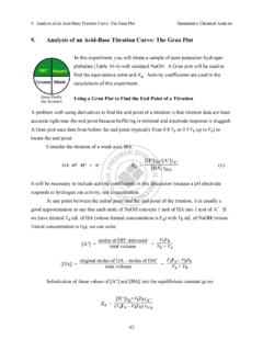
9. Analysis of an Acid-Base Titration Curve: The Gran Plot
web.mnstate.eduThe Gran plot in the acidic region gives accurate results even if there is CO2 dissolved in the strong base titrant. The Gran plot in the basic region can be used to measure CO2 in the strong base. For completeness, we note that if weak base, B, is titrated with a strong acid, the Gran
Related search queries
Basic Graphics in R, Plot, Lesson 6, File I/O, The Plot, Using SAS’s PROC GPLOT to plot data, Basic Plotting with Python and Matplotlib, PLOTTING AND GRAPHICS OPTIONS IN, Describing Relationships in Scatter Plots, Math 141 - Quantile-Quantile Plots, Plotting functions of more than one variable with Mathematica, Split plots, Gran plot